Custom illustrations and reimagined web design for an Asian fusion restaurant.
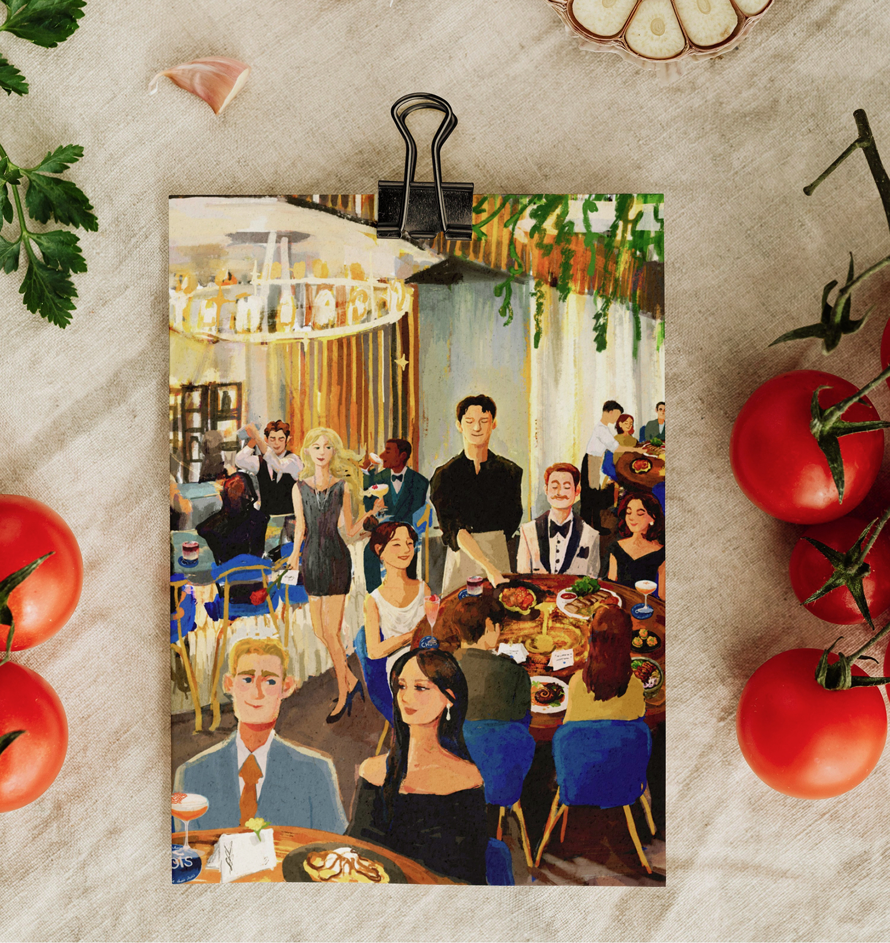
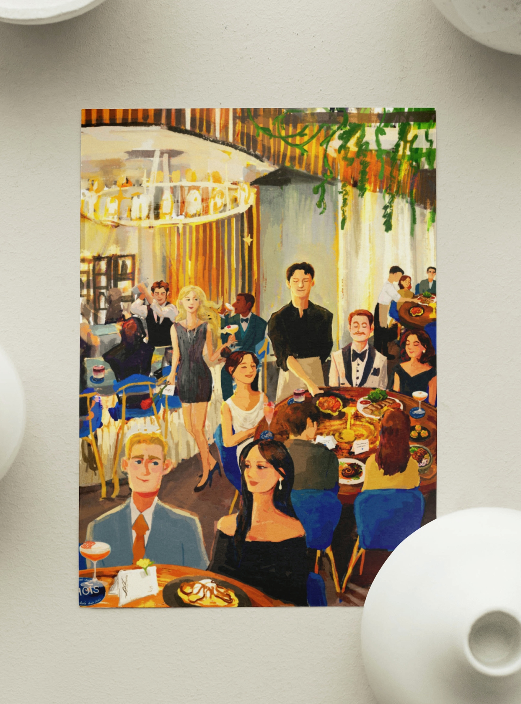
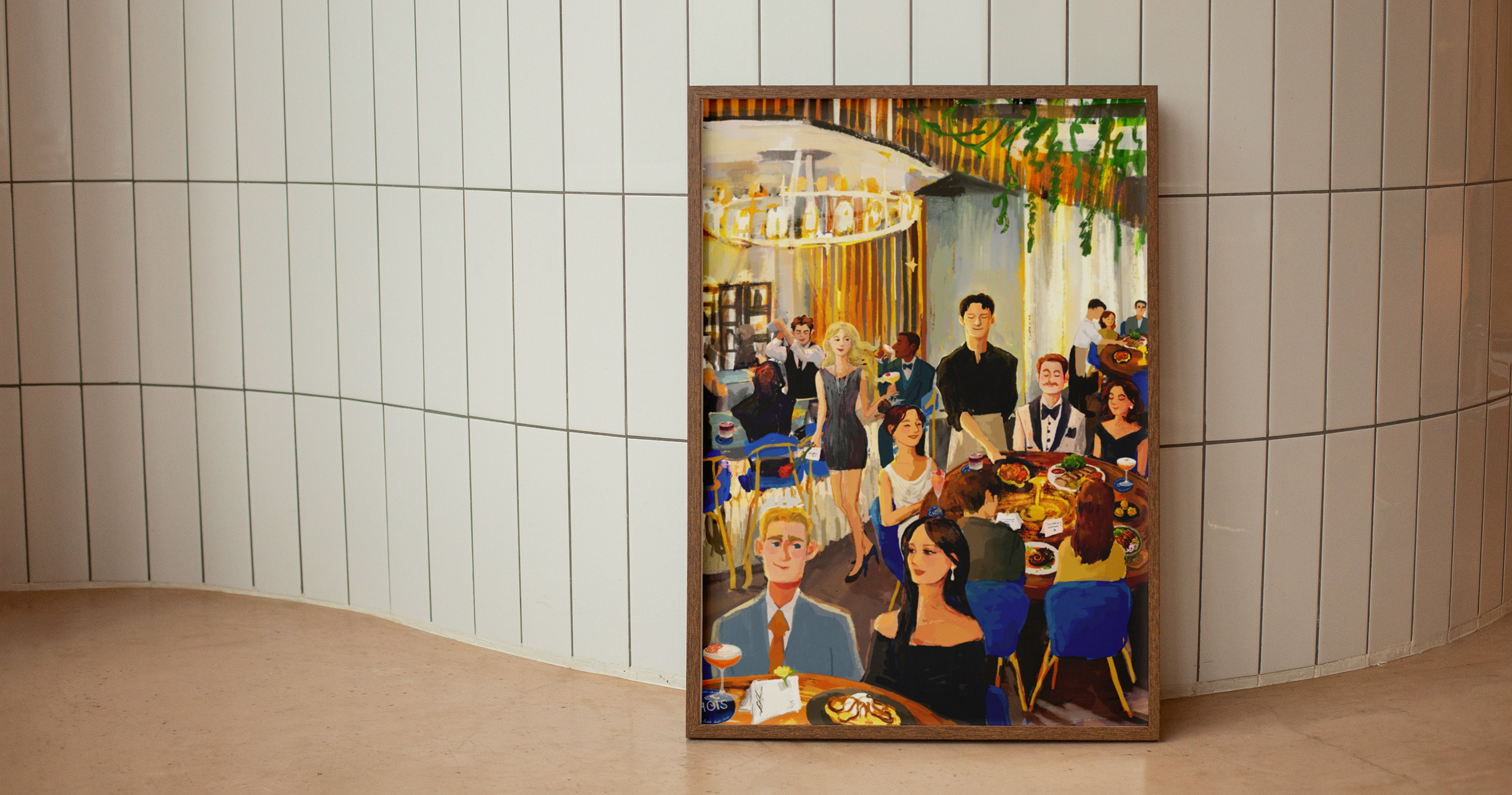
Created illustration for printing on branded welcome cards, placed on every table to make every dinner even more special.
Redesigned website homepage for better usability and a more refined experience.
Located in Downtown San Diego, Choi's is an Asian fusion restaurant inspired by creativity, mixing local ingredients with the diverse flavors of the East. Its brand emphasizes warmth and charm in a contemporary dining experience.
Illustration, Branding, Web Design
Procreate, Illustrator, Photoshop, Figma
May 2025 — July 2025
Artisinal, Elegant, Romantic
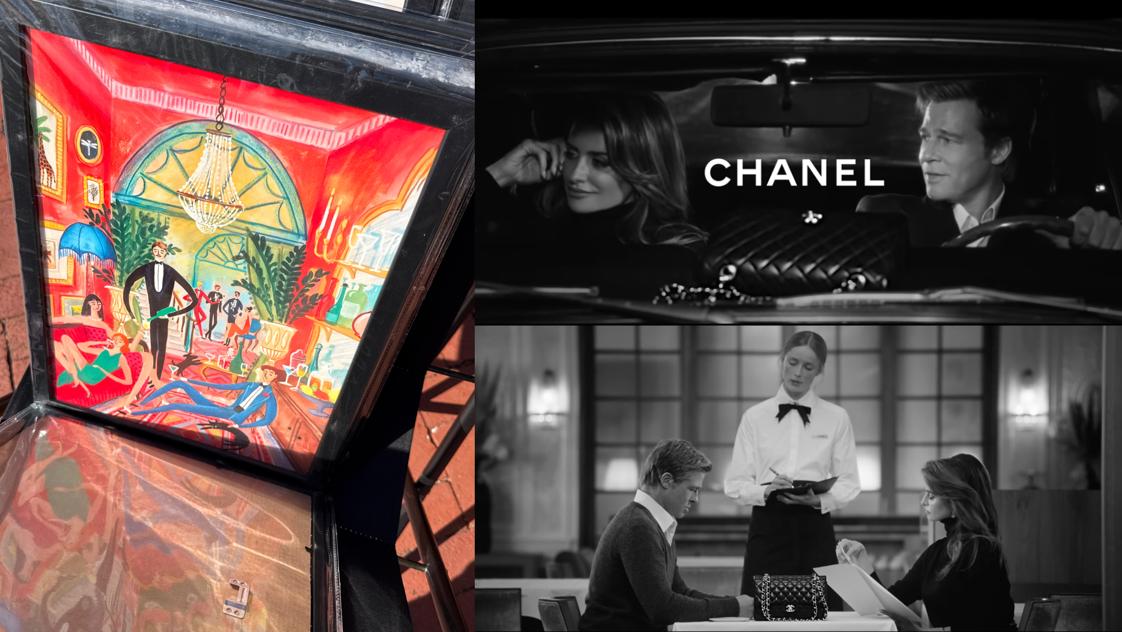
The visual direction began with a few key references from the client: a painting admired for its expressive composition and sense of movement, and a Chanel campaign that captured the elegant quality they wanted to evoke.
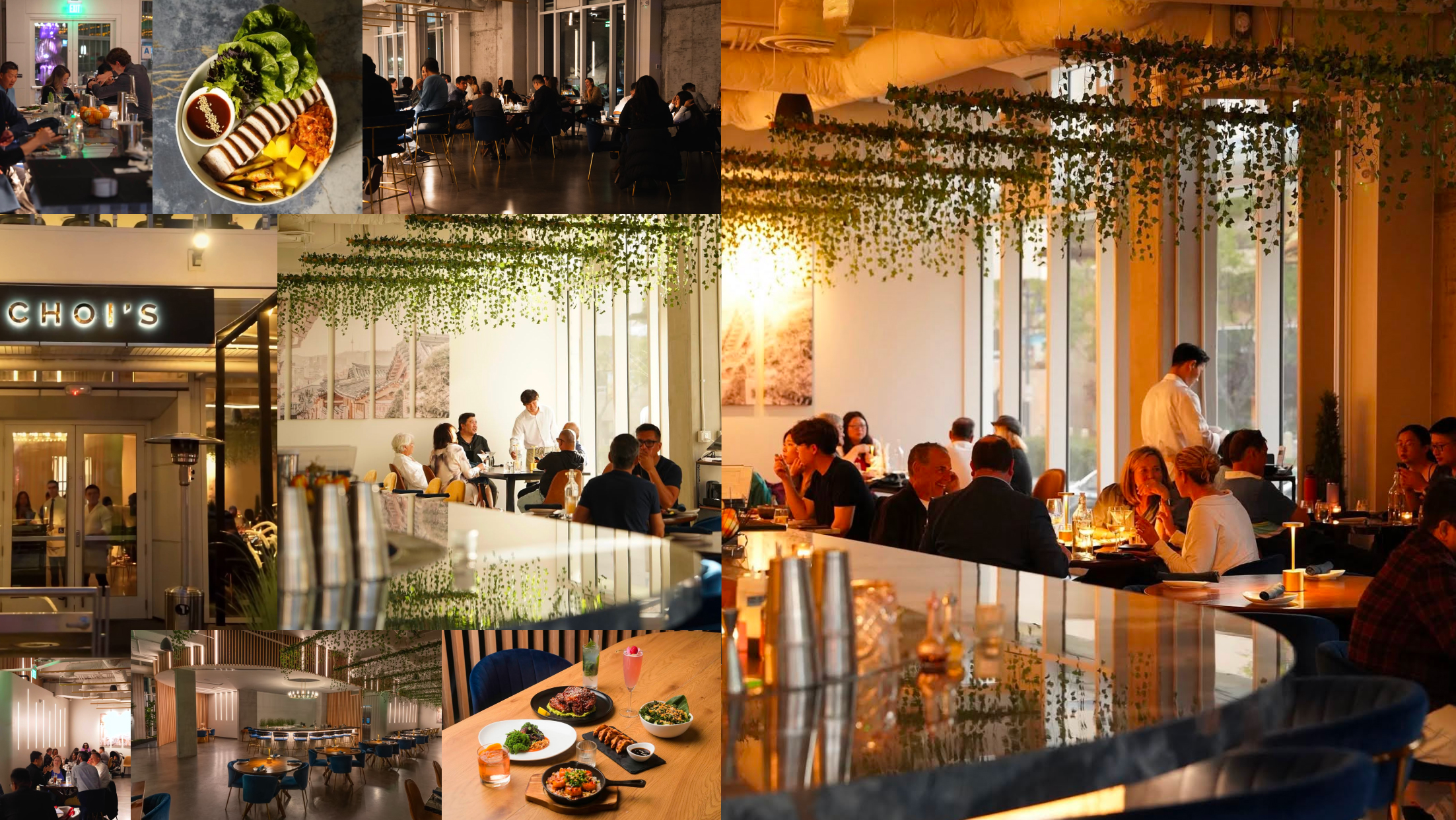
I gathered photographs of the restaurant and its dishes to better understand the space, paying attention to details like the warm lighting, lush hanging plants, and distinctly San Diego atmosphere that helped shape the illustration.
Together, these references established the tone for the illustration.
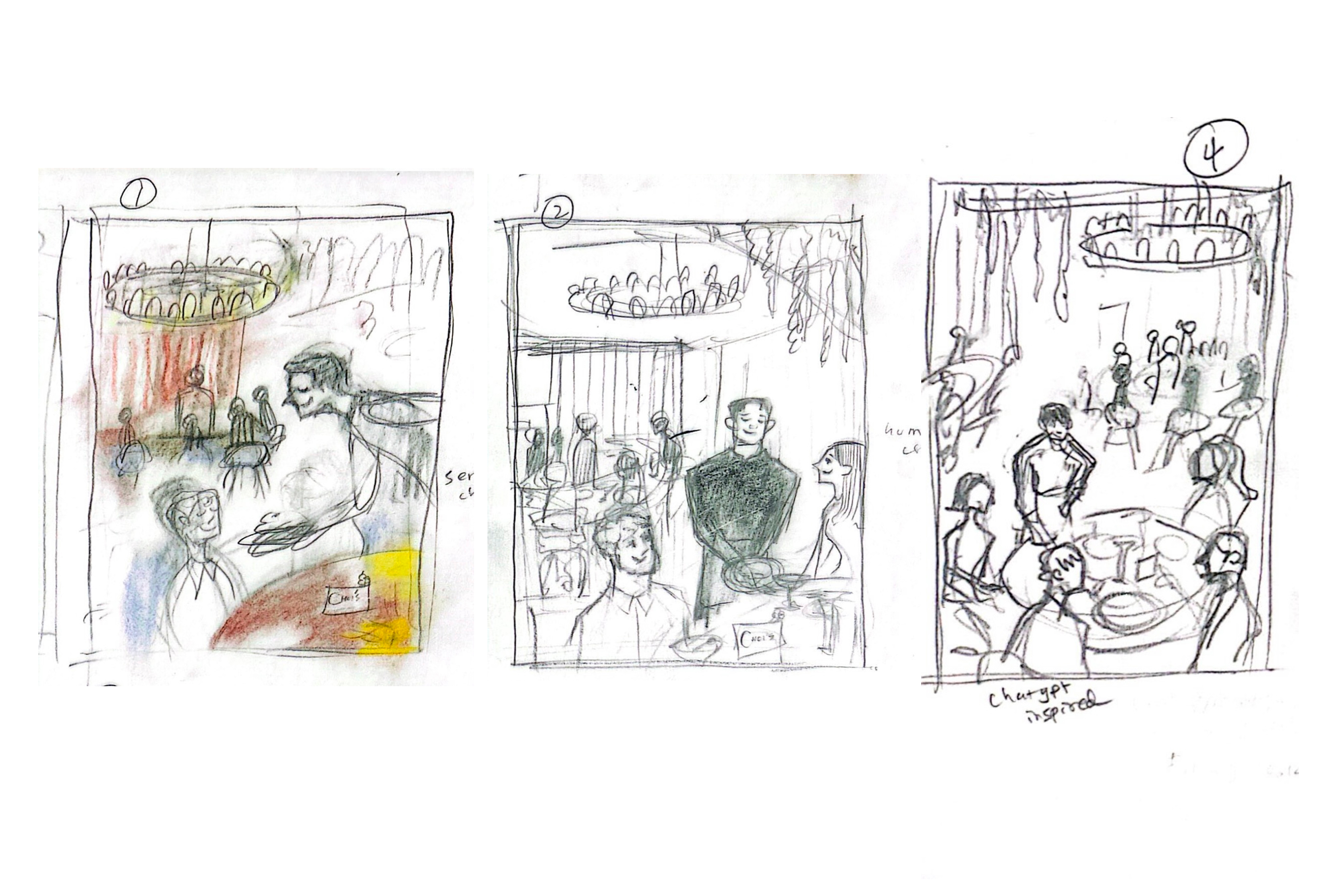
I explored different compositions and interactions to create a scene that felt lively and sophisticated.
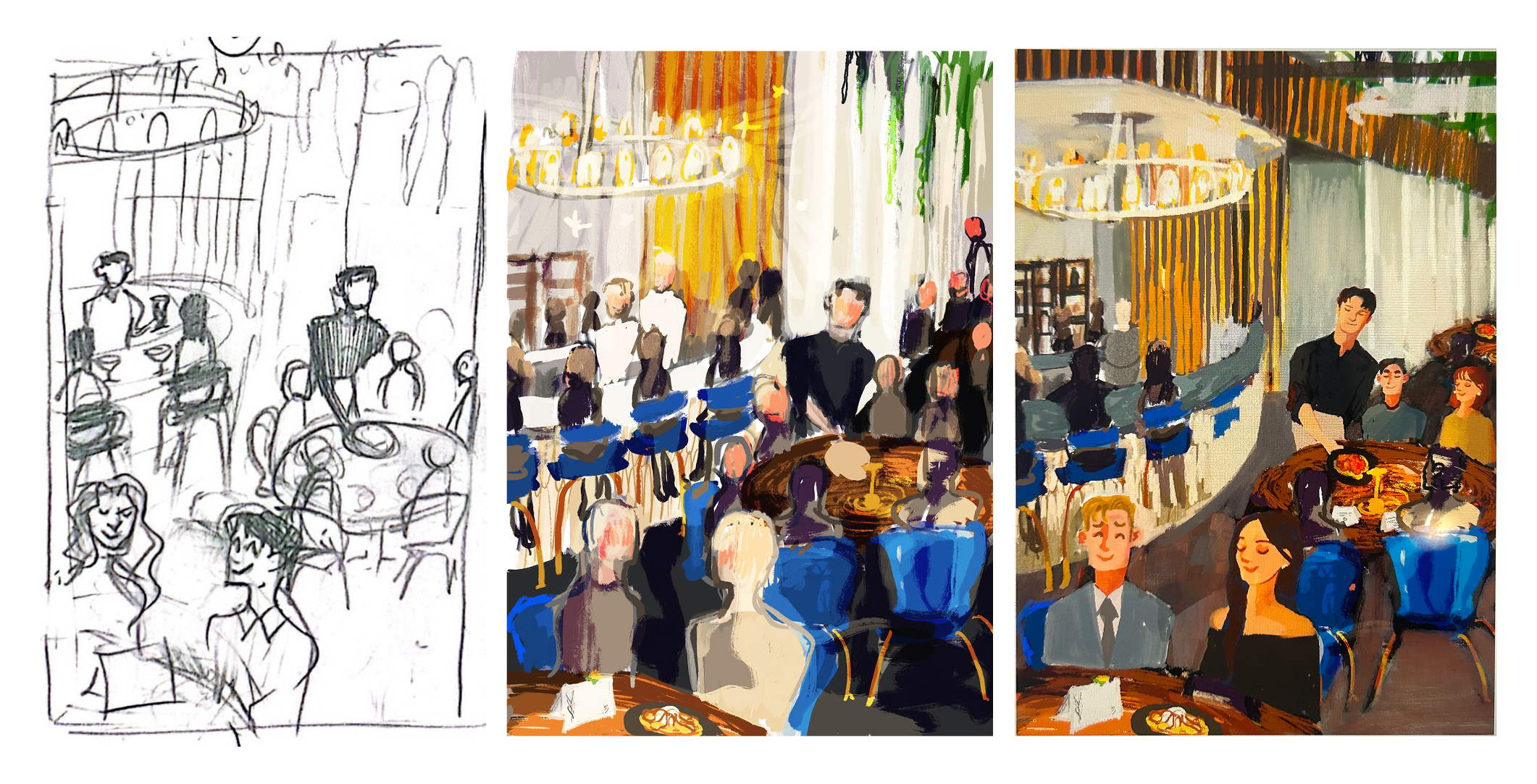
Drawing from the restaurant’s existing identity, I carried its signature gold and cobalt blue palette into the illustration, creating a visual connection between the brand and the new artwork.
I reimagined the space as a lively, Gatsby-inspired scene filled with conversation and warmth. Guests mingle beneath glowing light, enjoying signature cocktails and dishes distinct to Choi’s. I aimed to create a sense of elegance and hospitality through the details.
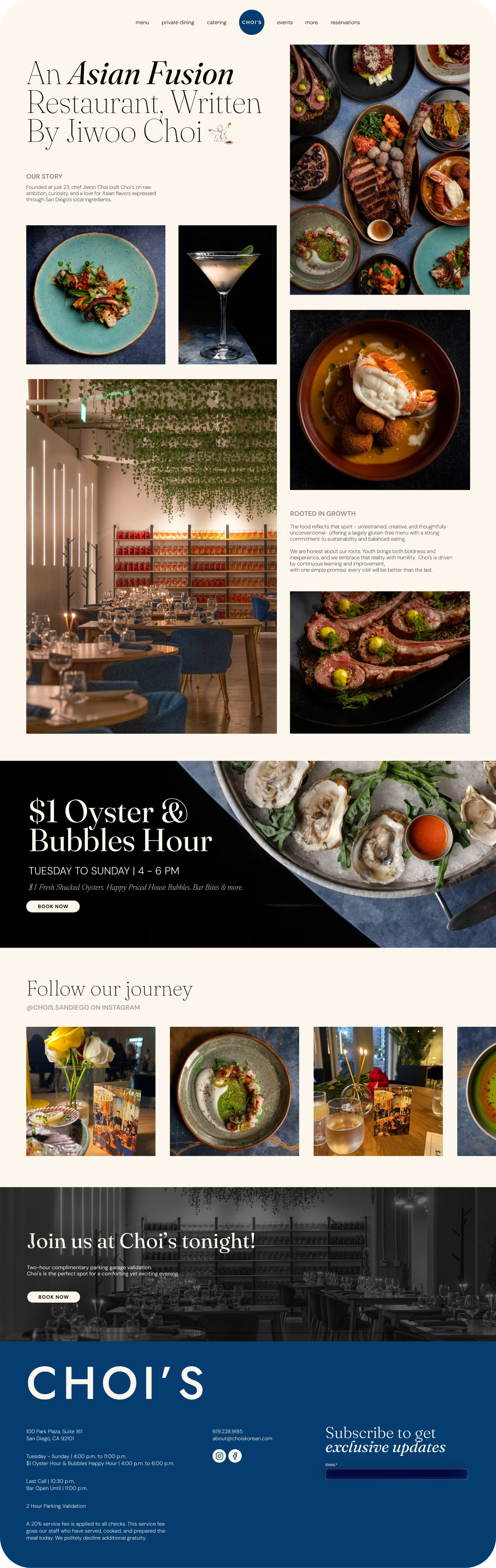
As part of the illustration research, the restaurant’s existing website offered an opportunity to further explore its brand and visual identity. The redesign built on the illustration’s visual direction, maintaining the sophistication and charm of the restaurant into the digital experience.
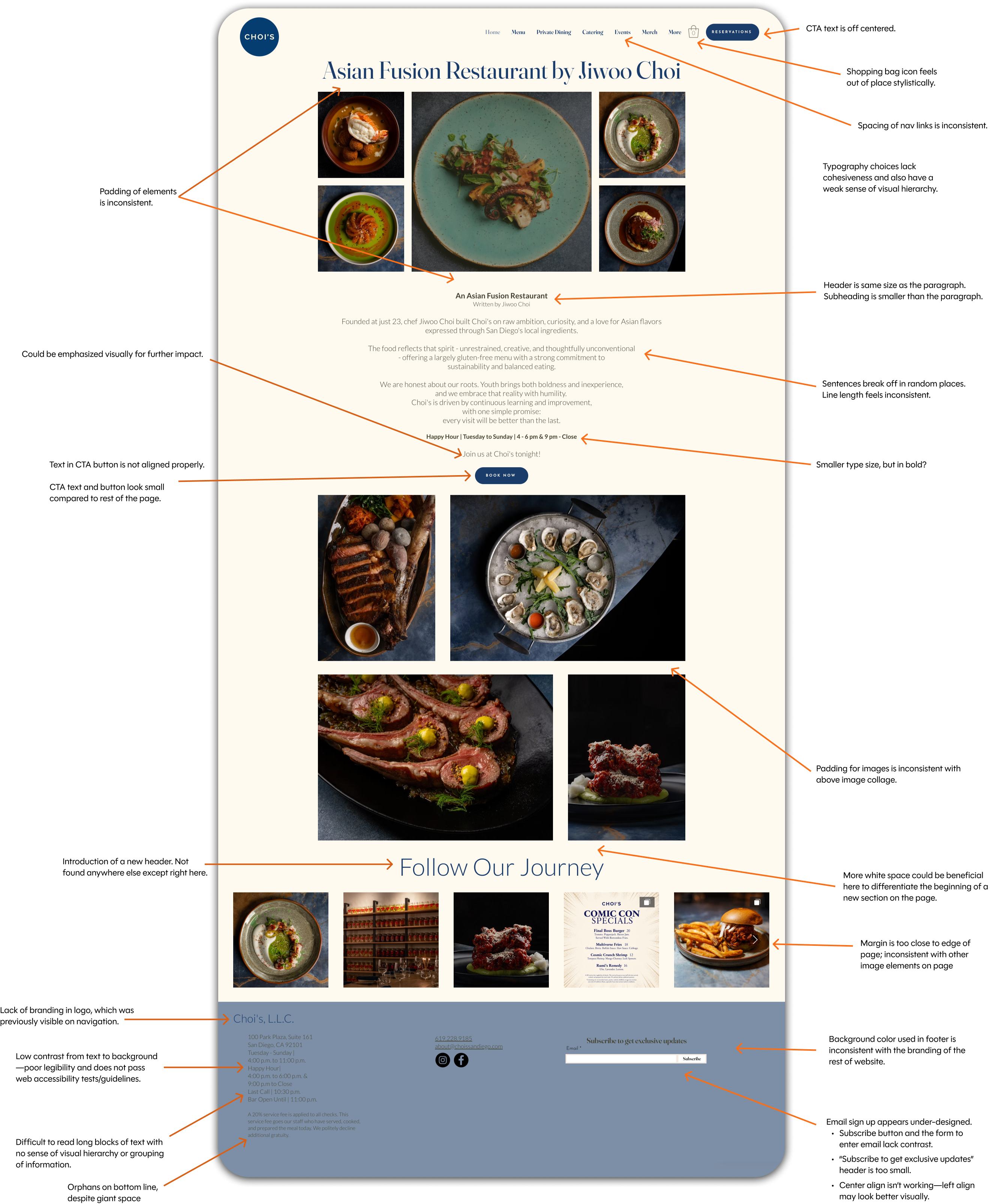
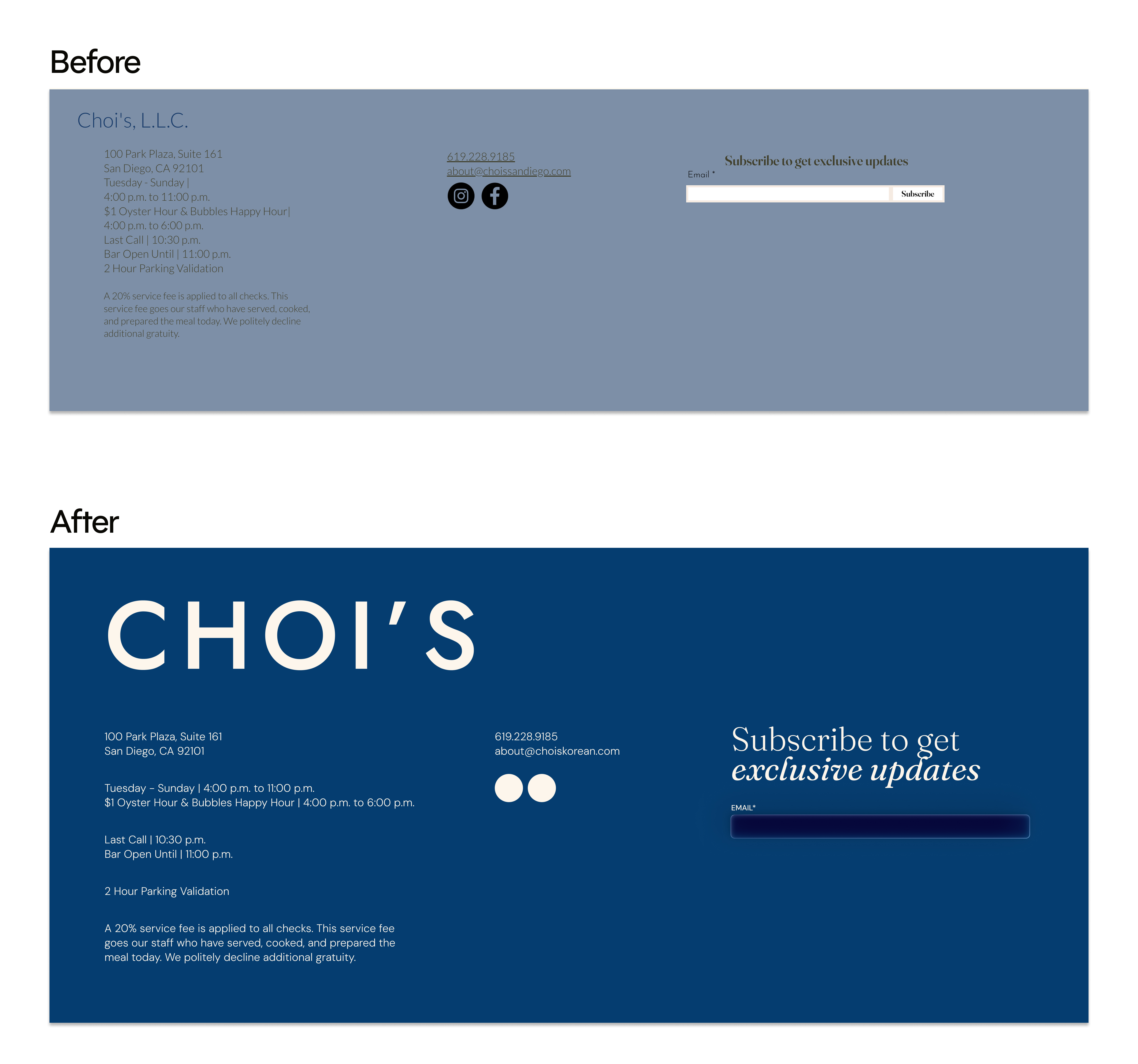
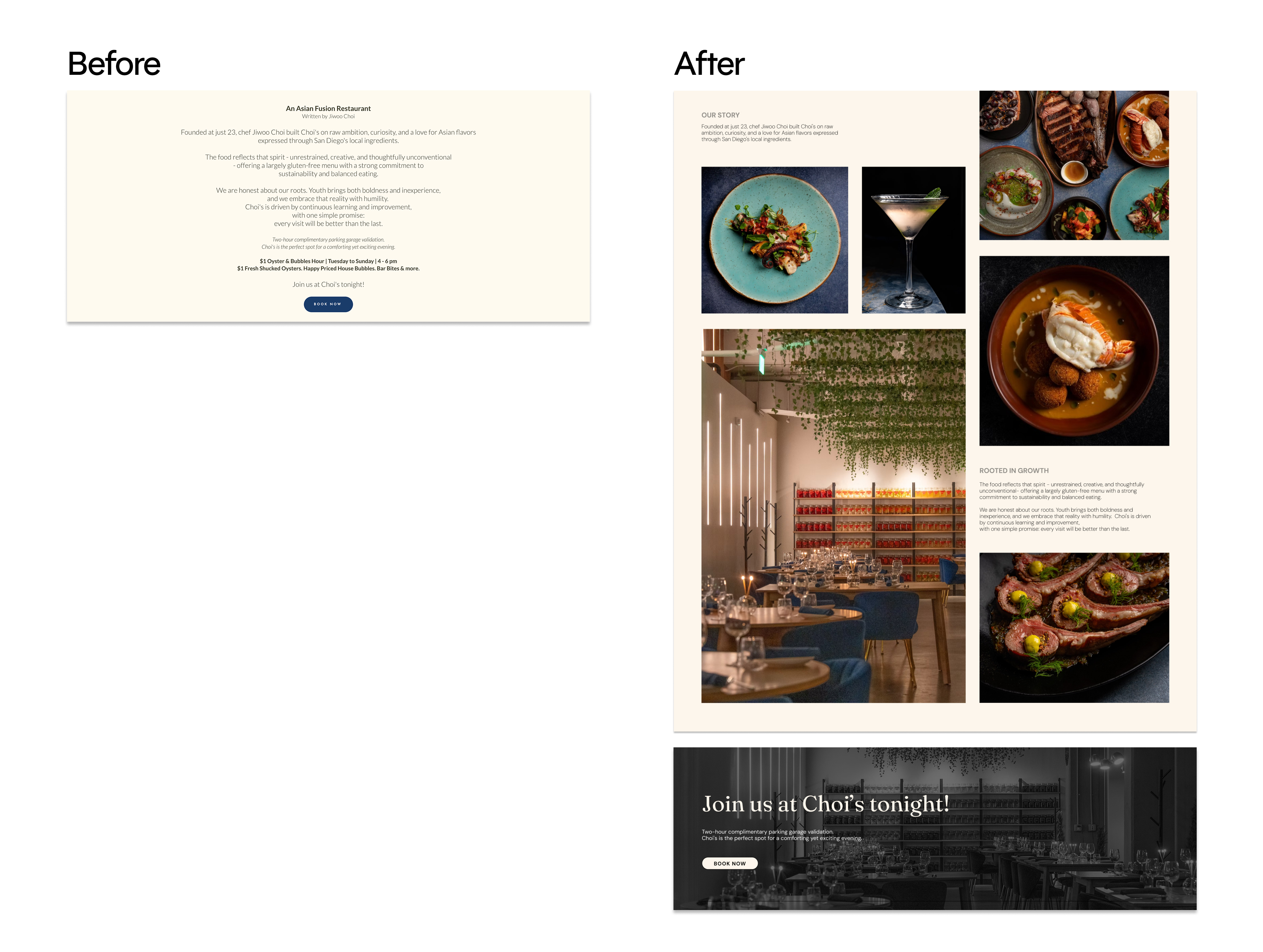
A visual and usability audit of the existing homepage revealed opportunities to improve spacing, typography, alignment, and layout. While the site captured the restaurant’s character, these inconsistencies made the experience feel less cohesive and harder to navigate. These findings helped establish a clearer direction for the redesign.
The homepage was reimagined with a cleaner, more contemporary approach while staying true to the restaurant’s personality. I maintained an image-heavy composition to showcase the restaurant’s interior and variety of dishes, while simplifying the navigation to keep it concise and easy to use. I also added clear CTAs for booking a reservation and organized the visual information in the footer.
Rather than grouping all of the text into one large paragraph, as the original website did, I intentionally spread it throughout the page so users could gradually take in the restaurant’s story as they moved through the images. I wanted the experience to feel almost like turning the pages of a book, where users could immerse themselves in the story while taking in the visual details.

#053d70

#FCF6EC

#090805
undercase type
colophon foundry
Featured illustration was created under contract for Choi’s. Website redesign is an unofficial concept project created for portfolio presentation purposes.
All original photography and brand assets belong to Choi’s.
The client wanted a custom illustration that captured the lively, sophisticated atmosphere of their restaurant. As a creative starting point, they shared a painting they had discovered and admired for its expressive composition and vibrant storytelling. Inspired by its energy—not its content—I reimagined the concept through the lens of their space, creating an original scene filled with conversation, movement, and warmth.
To further define the mood, the client referenced a Chanel campaign that embodied the feeling they envisioned: romantic, elegant, and timeless. Drawing from both references, I created an illustration with a Gatsby-esque ambiance, where guests mingle beneath warm lighting and every detail contributes to a sense of celebration and refined hospitality.
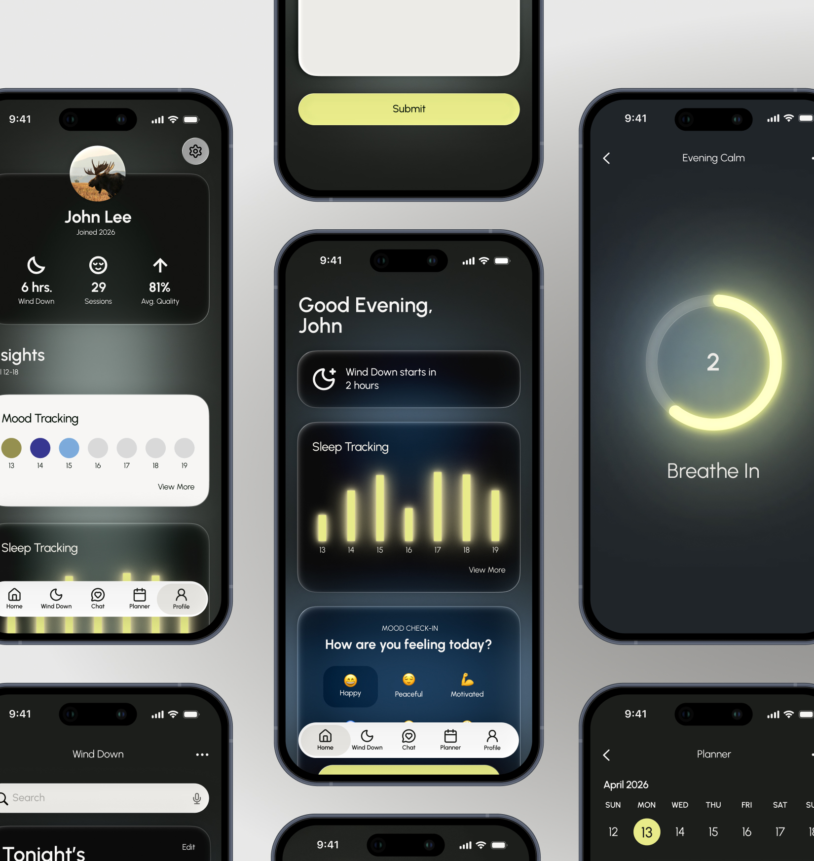
A sleep and wellness app that helps turn
evenings into moments of calm.
E-commerce branding for a conceptual luxury chocolate brand.