A sleep and wellness app that helps turn evenings into moments of calm.
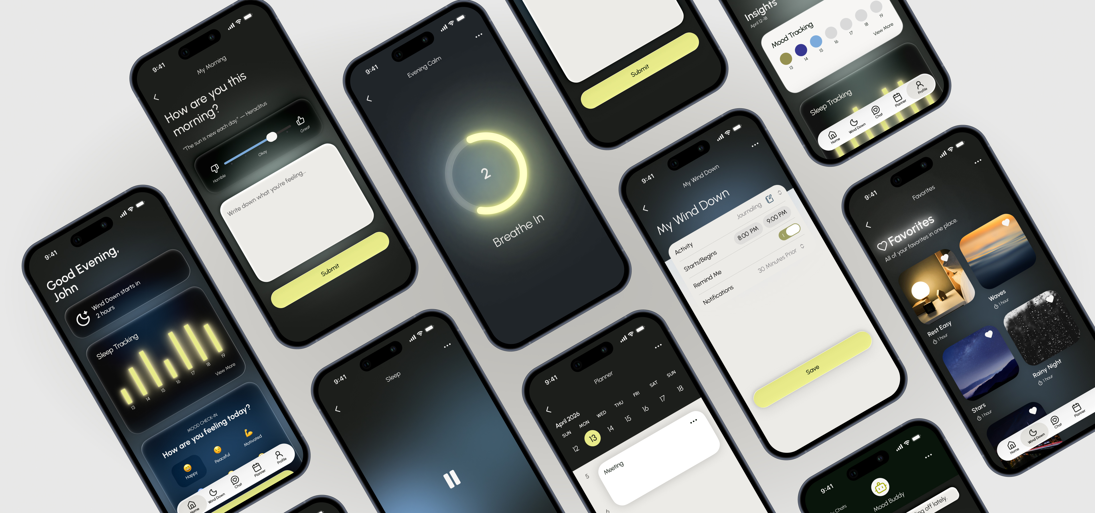
LowLight is a mobile app designed to help stressed young professionals protect their personal time and get better rest. By connecting their schedule with personalized wind-down routines, LowLight turns rest into an intentional part of the day rather than something left over after everything else is done.
Young professionals in their mid-twenties to thirties reclaim nighttime as their only personal time after work. This results in intentionally delaying sleep despite fatigue, leading to a cycle of sleep deprivation and a loss of control over their time and well-being.
UX Research, Product Design, UI Design, Branding
Figma, Illustrator, Photoshop
June 2026
Calm, Modern, Simple
Mobile App, Logo, High Fidelity Prototype
Across different lifestyles and routines, the same themes appeared again and again:
Work anxiety, unresolved thoughts, and mental overstimulation were the most common causes of poor sleep.
Participants had experimented with supplements, sleep aids, and routines, but most struggled to maintain them over time.
Every participant used their phone before sleeping and expressed frustration about the habit.
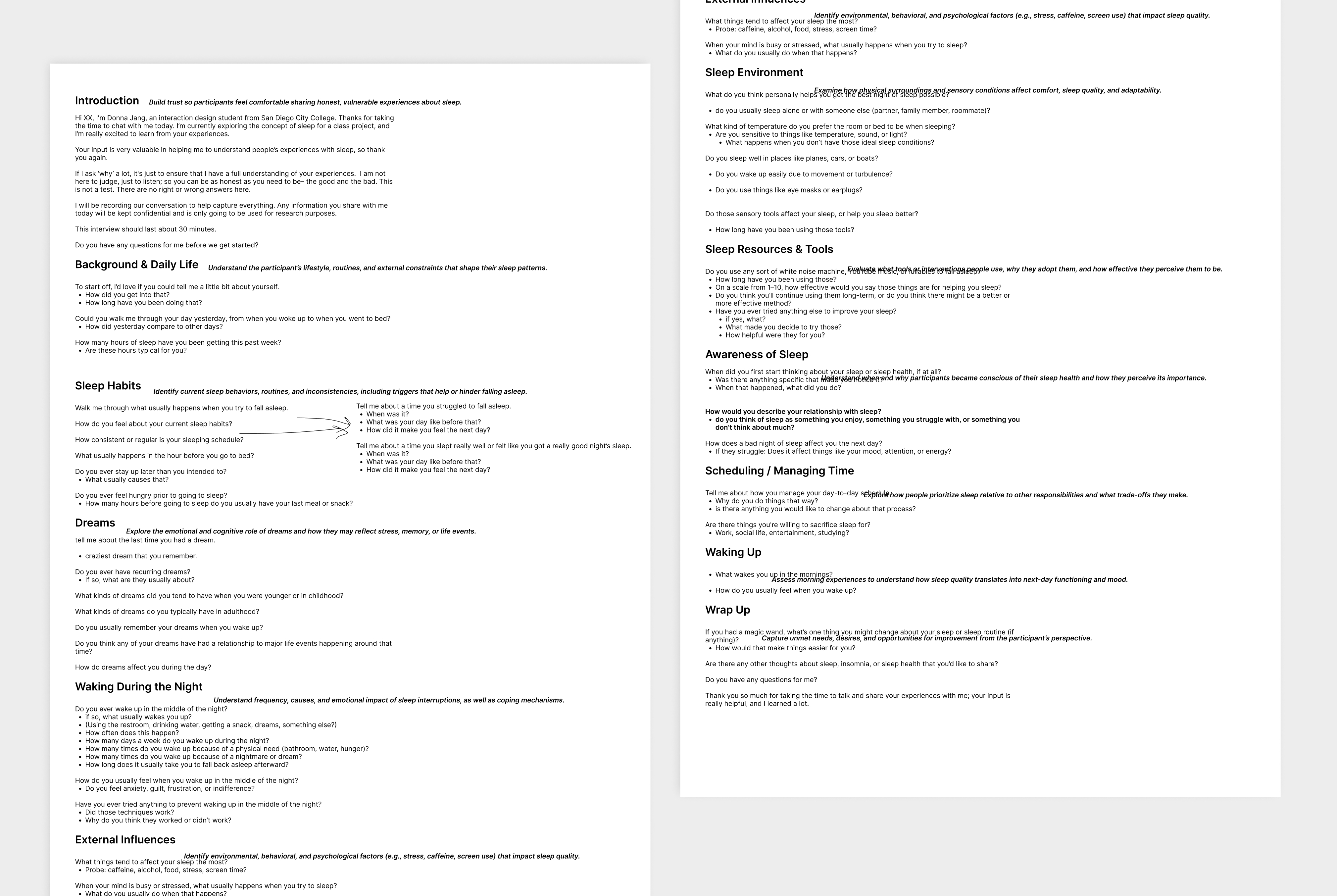
Interview Guide
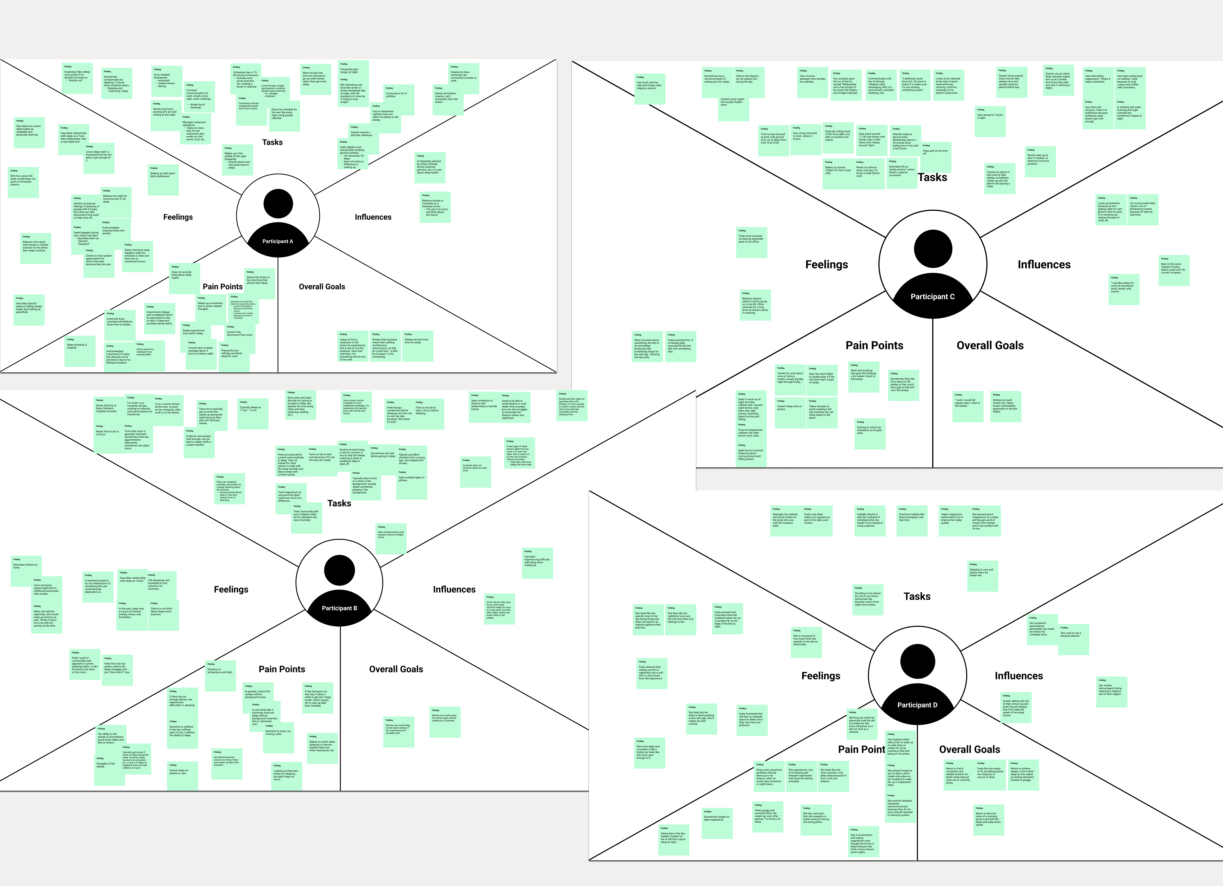
Individual Empathy Maps

Aggregated Empathy Maps
To better understand users' relationship with sleep, I conducted interviews and synthesized the conversations into empathy maps. My goal was to understand where the poor sleep was coming from holistically, rather than thinking of it as an isolated issue.
This helped uncover recurring behaviors, frustrations, and unmet needs that would later inform the product direction.
Individual Empathy Maps
Aggregated Empathy Maps
Lorem ipsum dolor sit amet consectetur. Facilisi mi placerat praesent vitae diam. Interdum lorem amet vel eu sit. Tellus nam scelerisque vitae lacus. Nibh aliquam amet faucibus senectus sed.
Work anxiety, unresolved thoughts, and mental overstimulation were the most common causes of poor sleep.
Participants had experimented with supplements, sleep aids, and routines, but most struggled to maintain them over time.
Every participant used their phone before sleeping and expressed frustration about the habit.

I analyzed existing sleep, wellness, and productivity apps to understand how they approached relaxation, habit-building, and nighttime routines. This helped me identify gaps and opportunities for LowLight to offer a more intentional way to wind down.
Lorem ipsum dolor sit amet consectetur. Facilisi mi placerat praesent vitae diam. Interdum lorem amet vel eu sit. Tellus nam scelerisque vitae lacus. Nibh aliquam amet faucibus senectus sed.
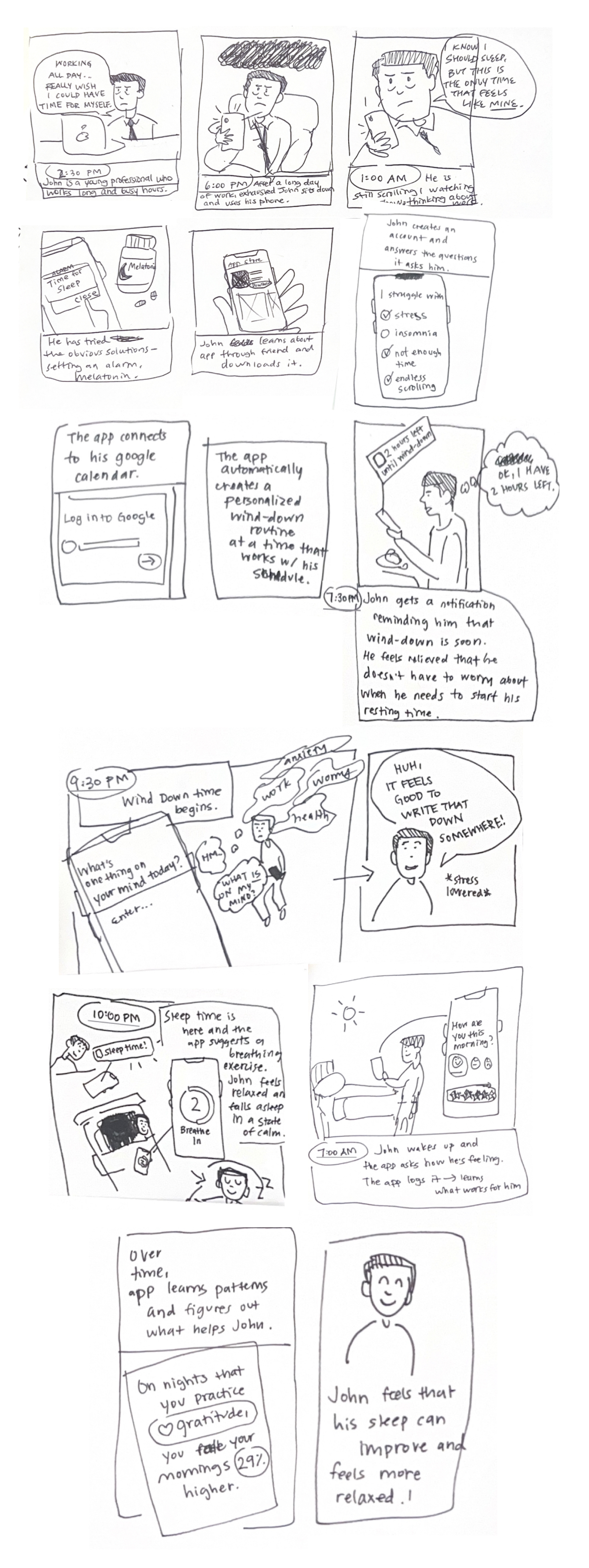
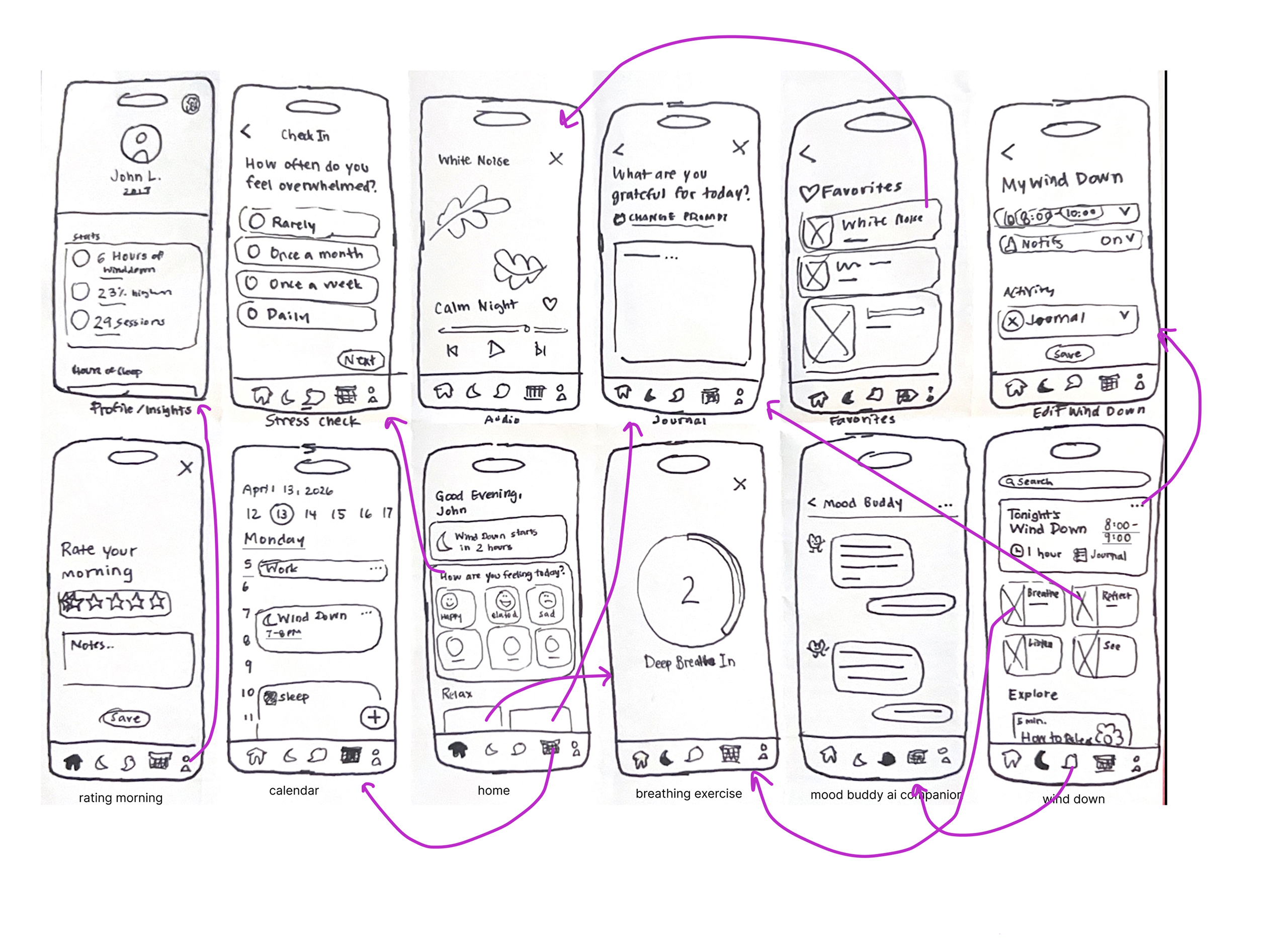
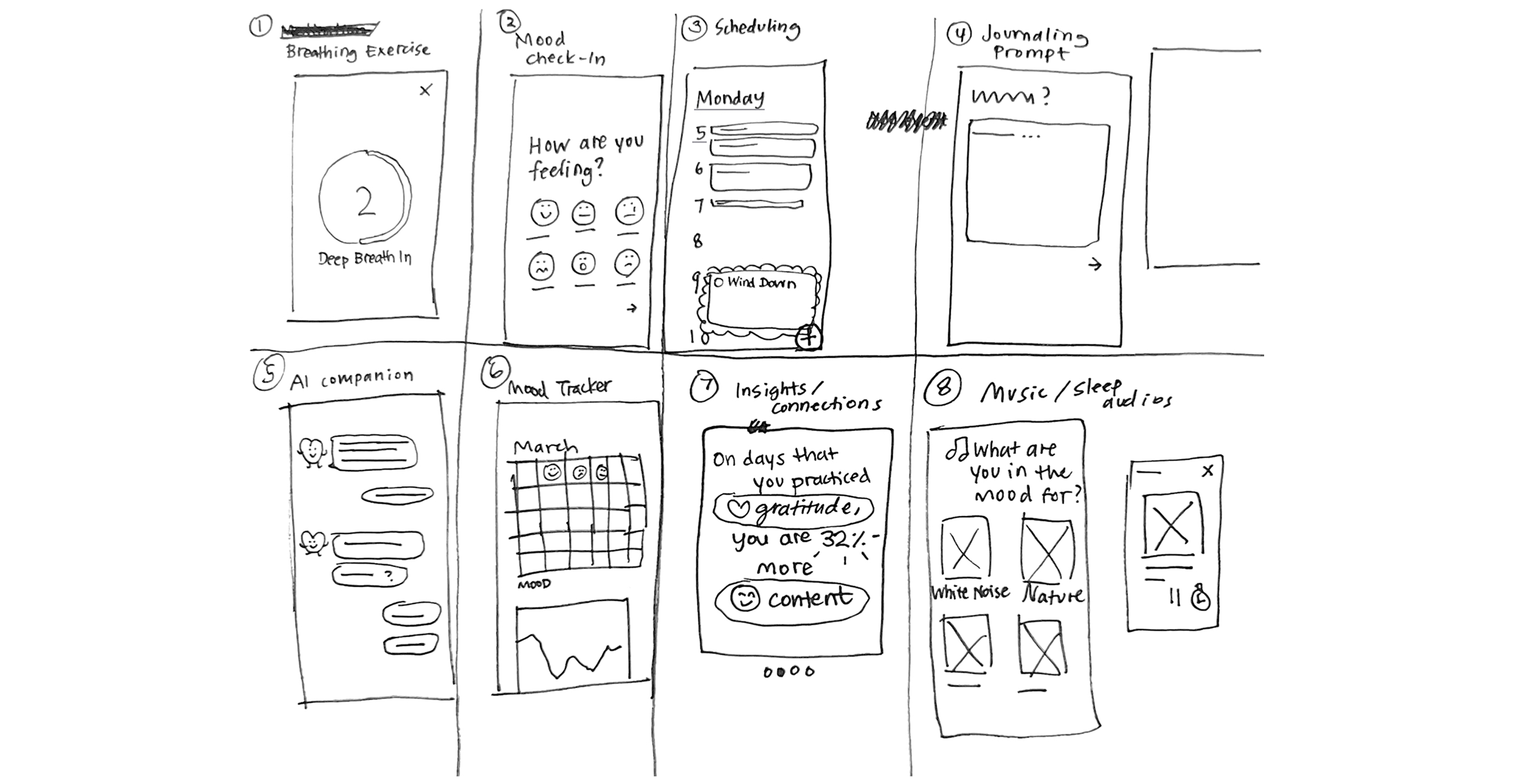
The storyboard helped me think beyond individual screens and map out the experience in a more emotional, human perspective. I explored information architecture, user flows, and core functionality through low fidelity sketching before moving into digital wireframes.
Lorem ipsum dolor sit amet consectetur. Facilisi mi placerat praesent vitae diam. Interdum lorem amet vel eu sit. Tellus nam scelerisque vitae lacus. Nibh aliquam amet faucibus senectus sed.
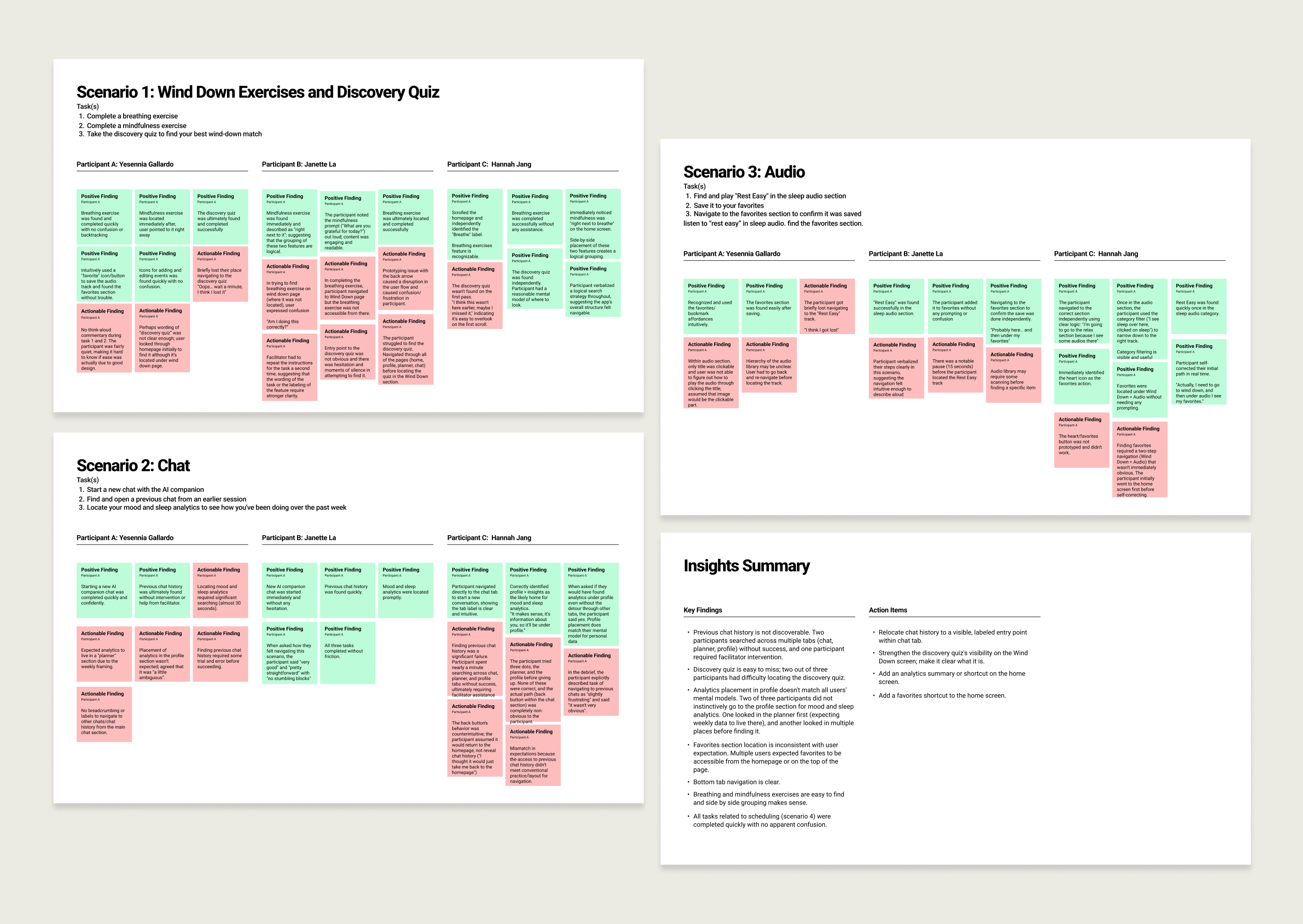
With the initial prototype in place, I conducted usability testing to see how easily participants could navigate LowLight's core features and complete key tasks.
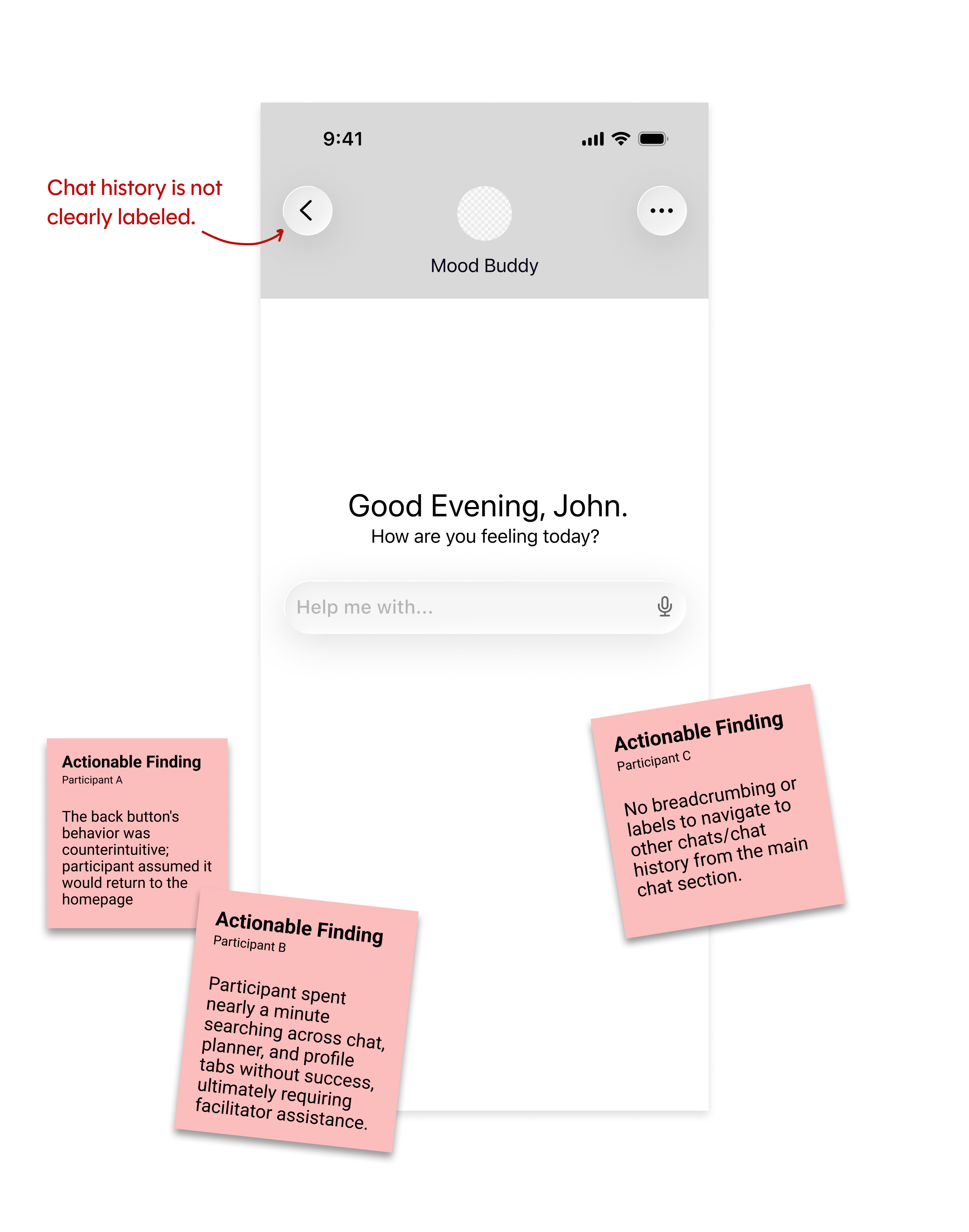
Testing revealed several areas where the interface didn't communicate hierarchy or navigation clearly enough. I used these findings to refine the information architecture and make important actions easier to discover.
Lorem ipsum dolor sit amet consectetur. Facilisi mi placerat praesent vitae diam. Interdum lorem amet vel eu sit. Tellus nam scelerisque vitae lacus. Nibh aliquam amet faucibus senectus sed.
Before
After
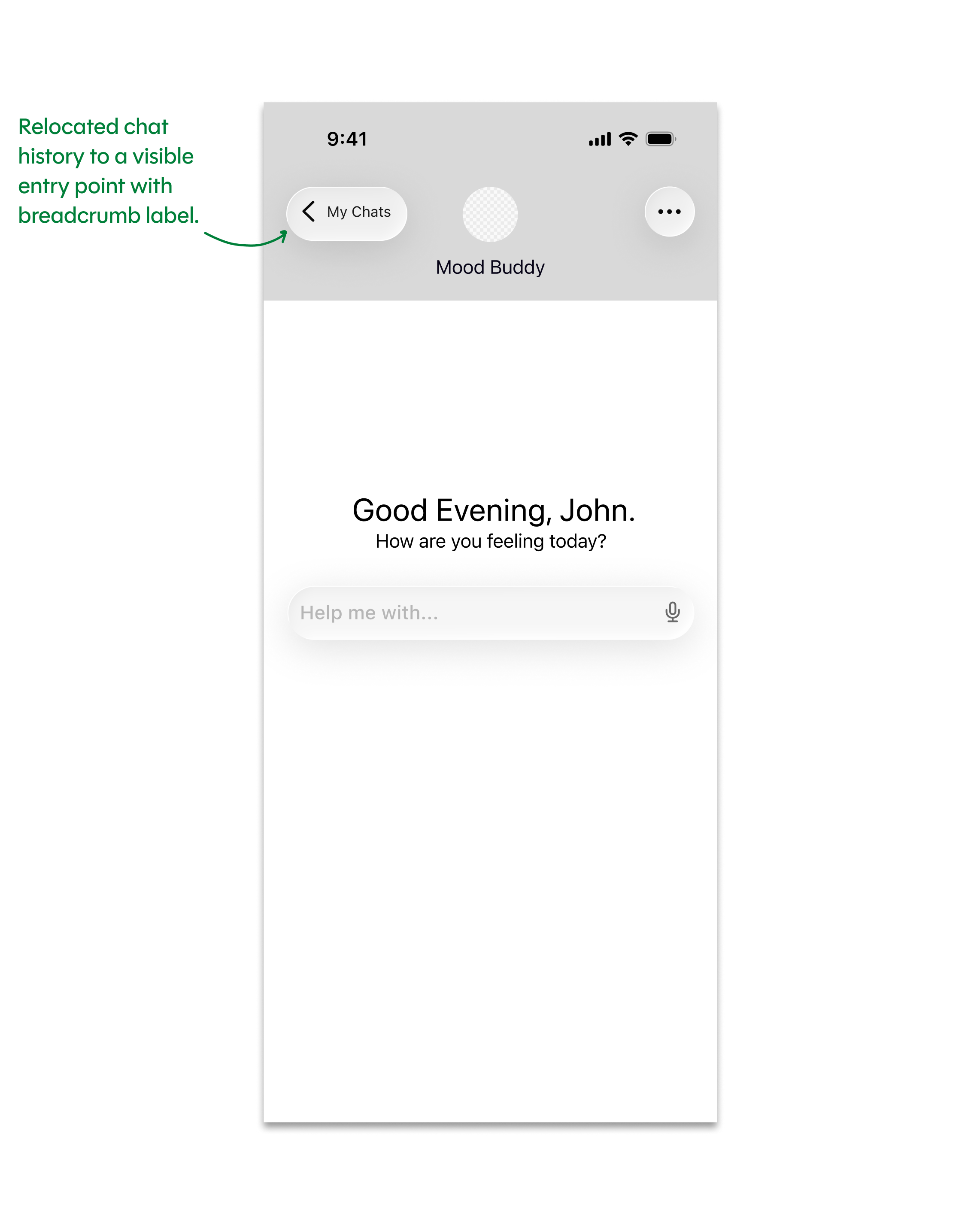
Before
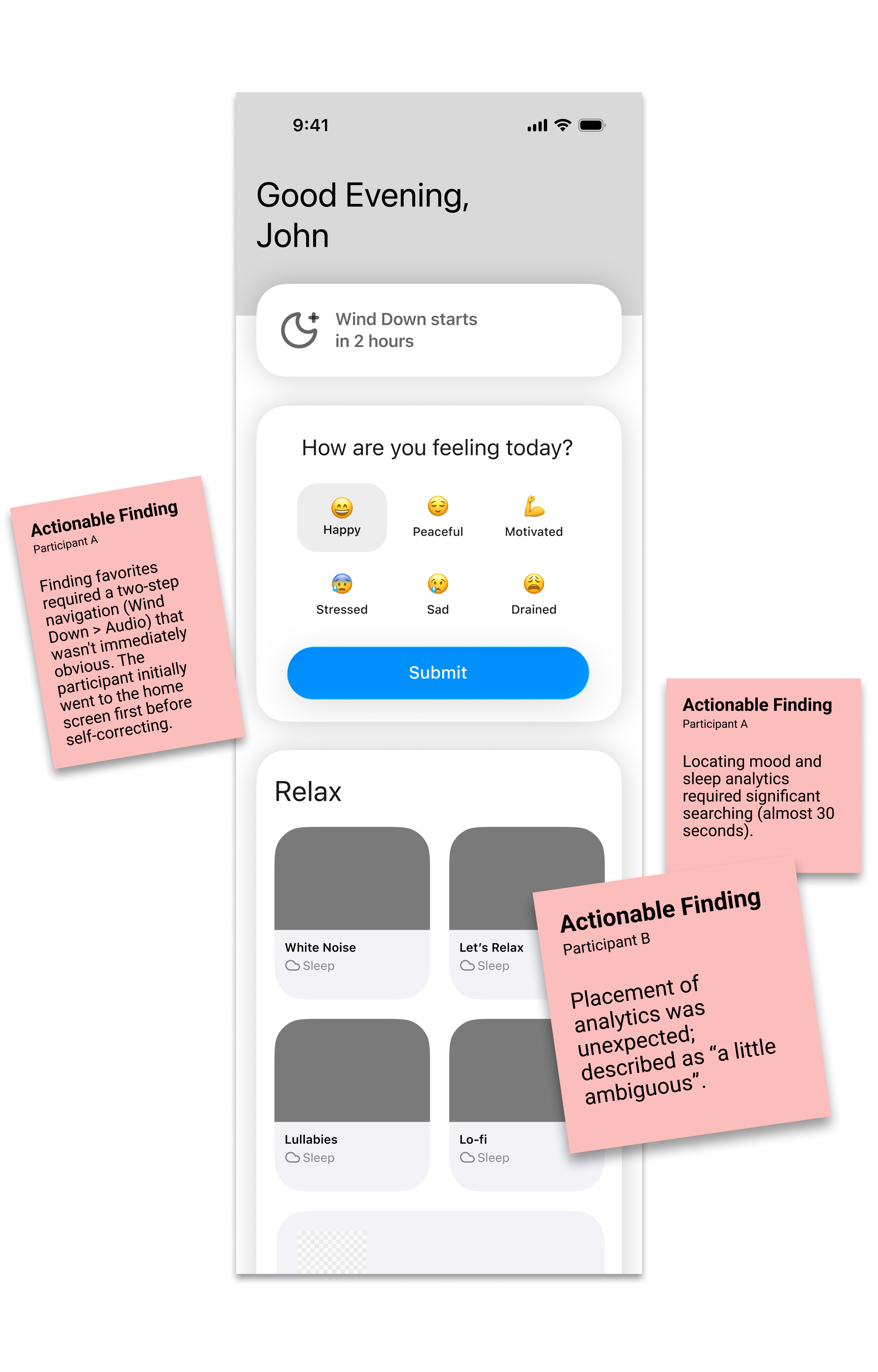
After
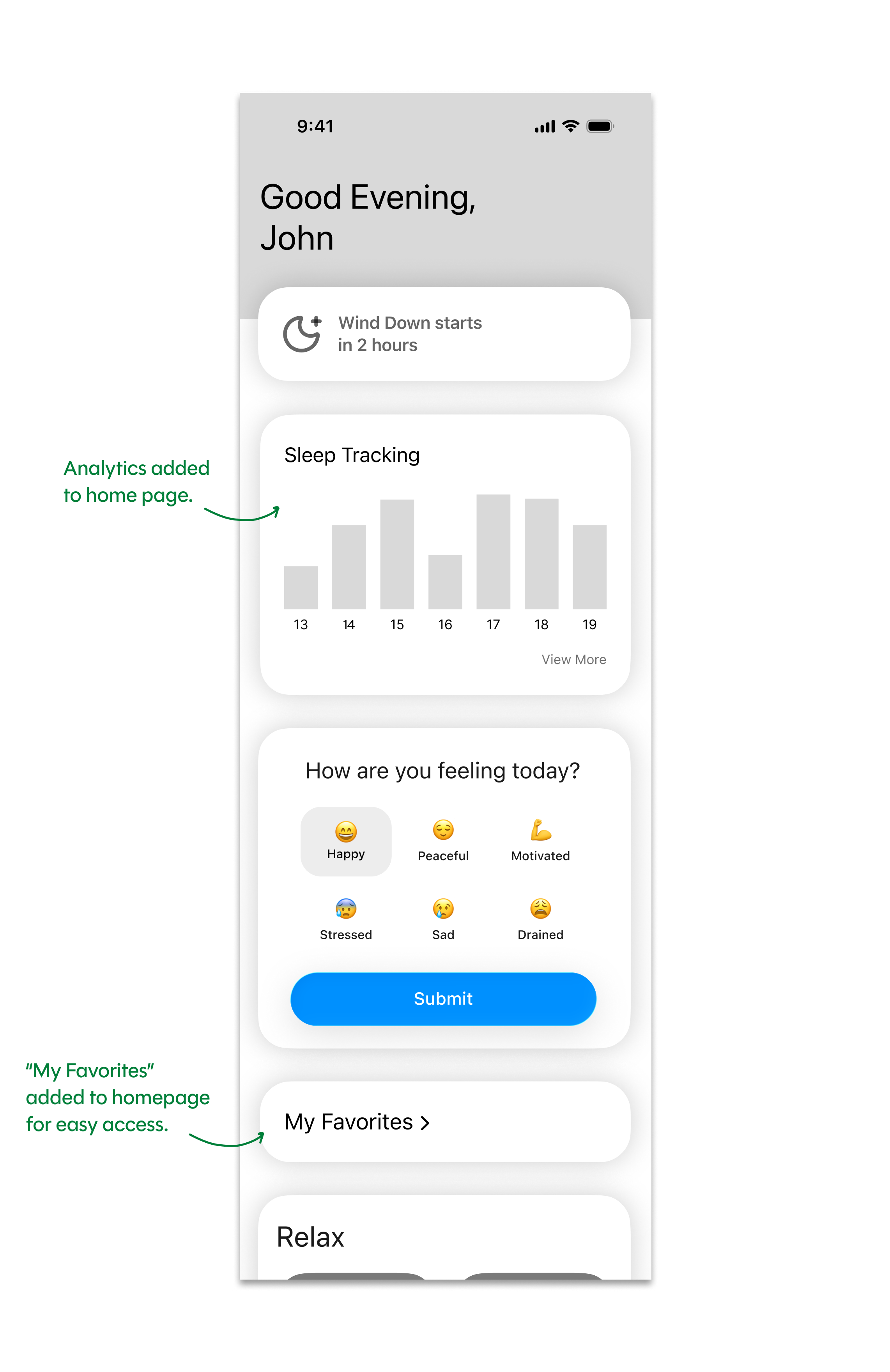
Before
After
Before
After
I focused on establishing a clear hierarchy across LowLight's main features; including wind-down routines, sleep content, mood tracking, planning, and Mood Buddy.
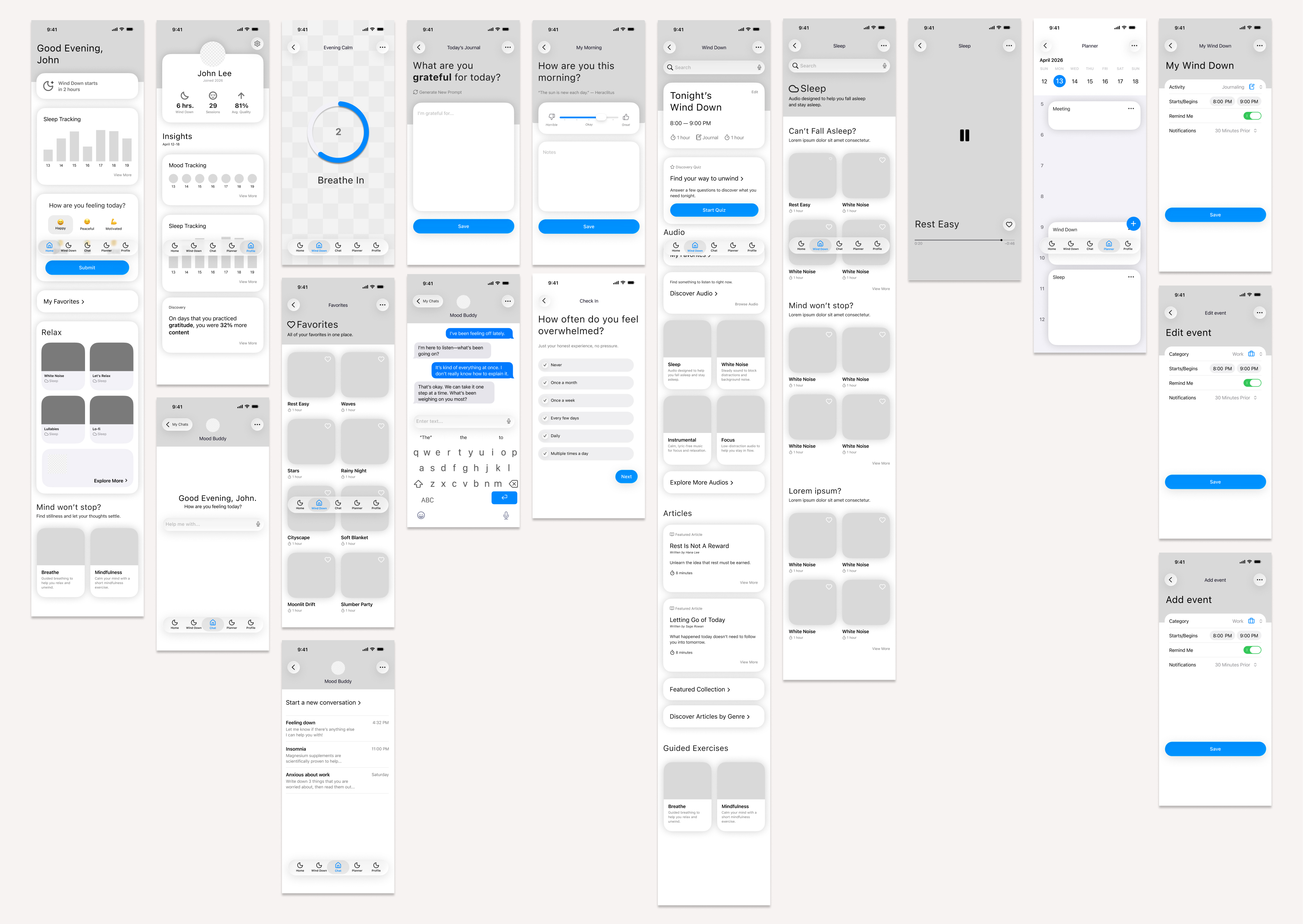
LowLight’s visual direction was inspired by soft lighting, nature, and dark, calming environments to create an experience that feels serene, removed from the hectic pace of everyday life.
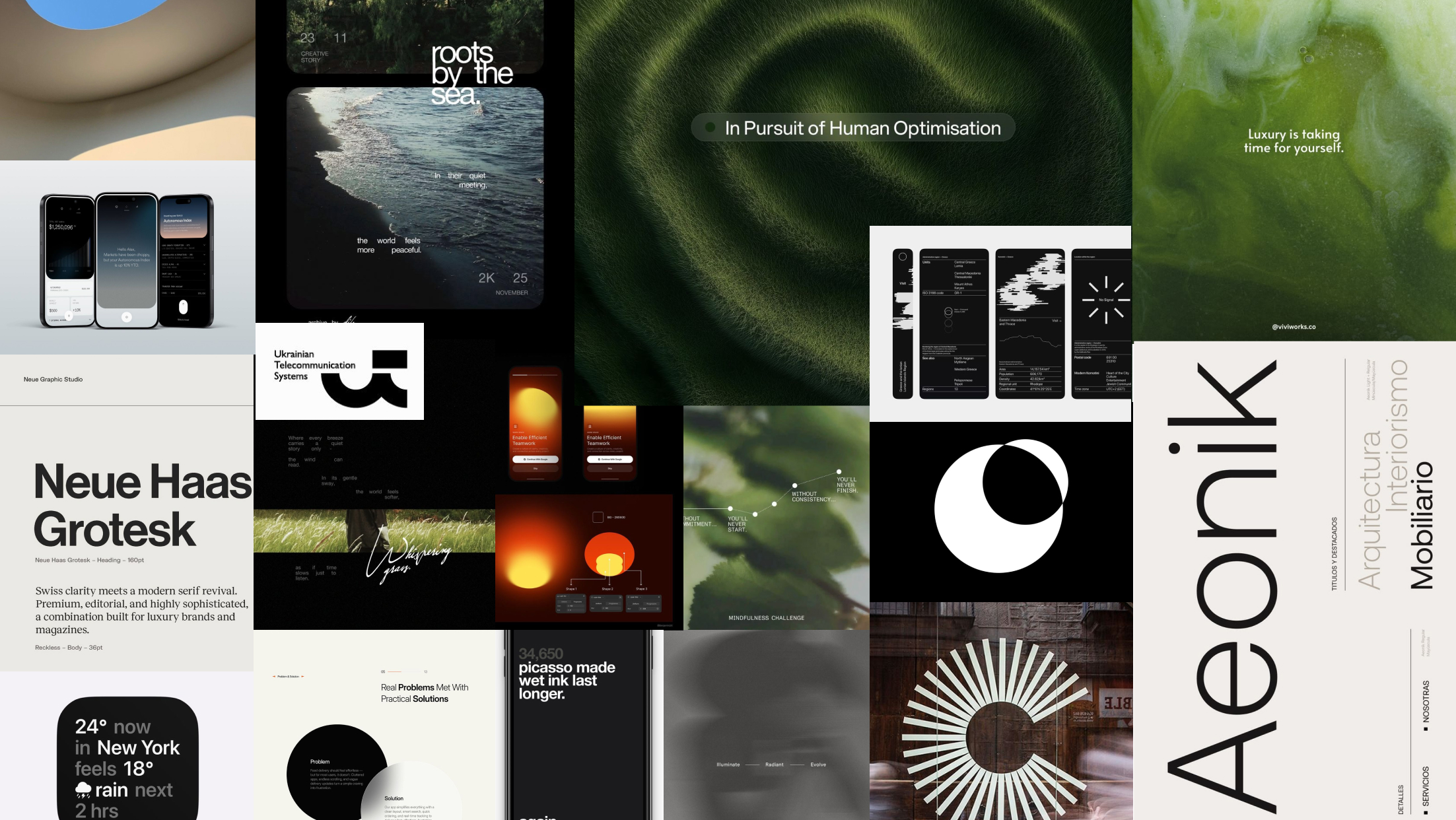
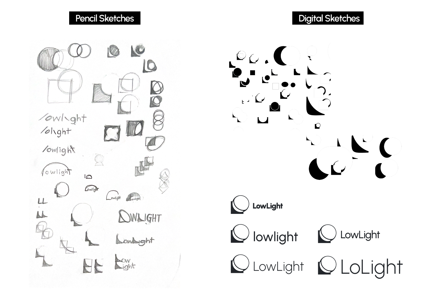
Drawing from my moodboard, I started by making rough sketches of geometric shapes. I was interested in exploring negative space, connecting shapes, and using overlap to create abstract pieces that felt spontaneous yet grounded. I wanted the forms to feel balanced without being too rigid. I created a shape inspired by both a crescent moon and a lamp, referencing the idea of low, soft light and winding down. This became the foundation for the logo.
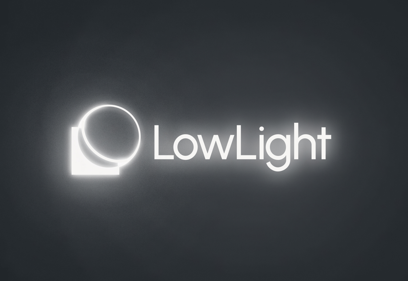
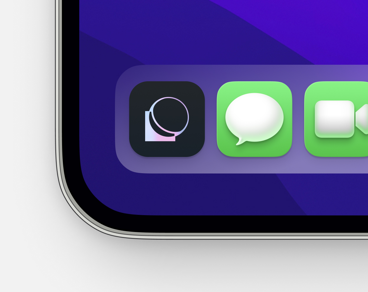
For the final icon and logo, I settled on a dark gray with subtle muted purple undertones, paired with subtly glowing text that evokes the feeling of soft light in the dark.
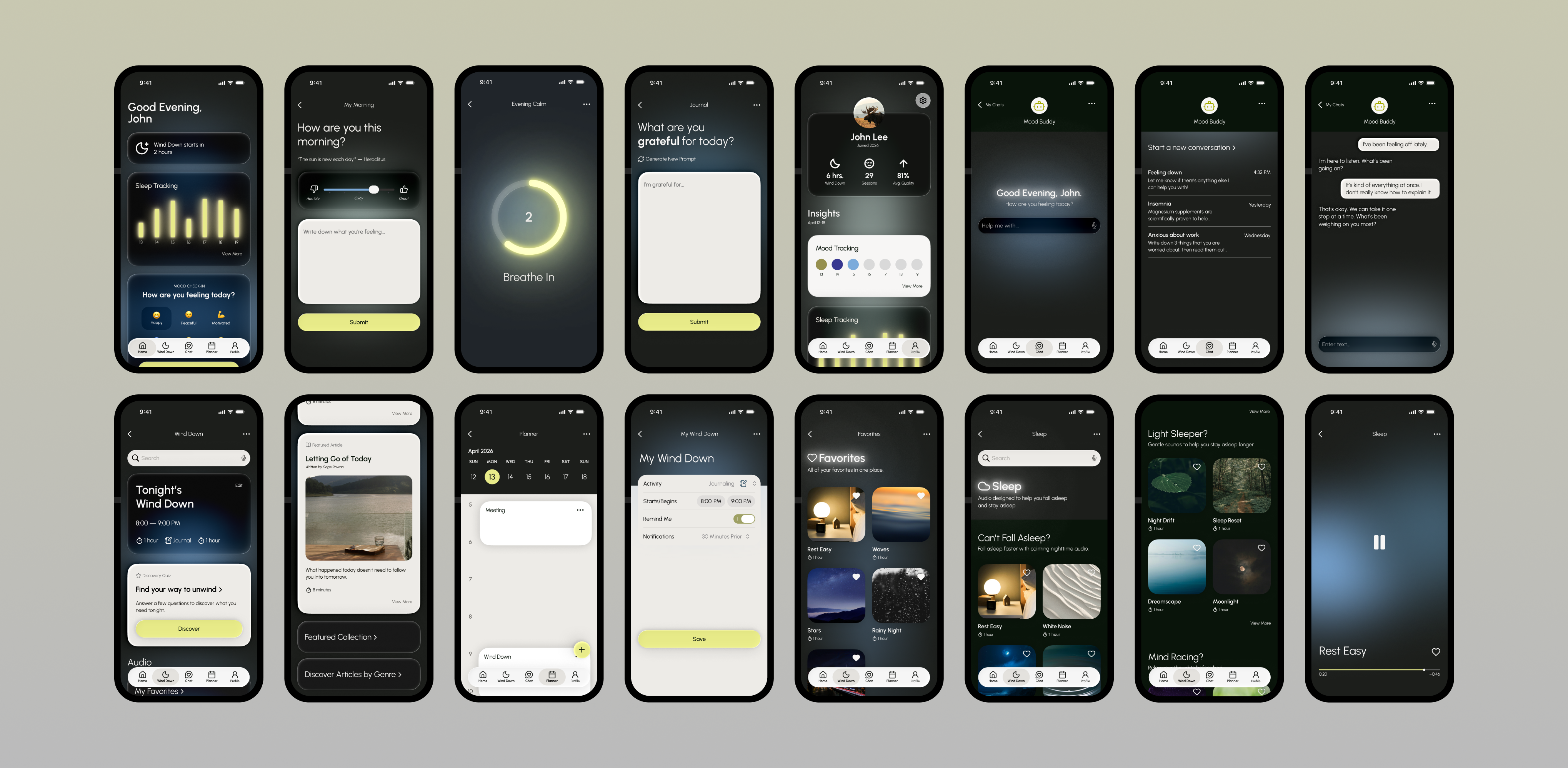
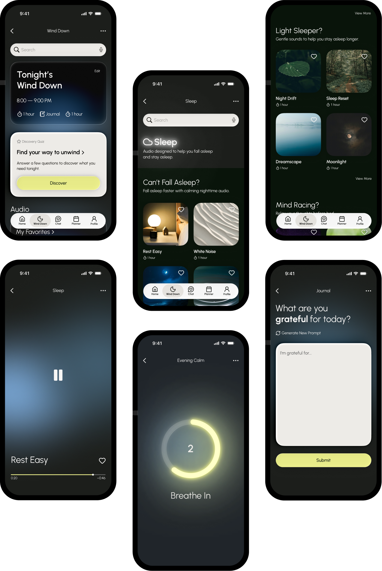
LowLight was designed around behaviors participants were already doing rather than idealized routines they were unlikely to maintain. The goal was to make winding down feel easy enough to return to every night.
Wind Down gives users a dedicated moment to pause, reset, and prepare for rest.

A personalized routine that adapts to how you’re feeling and what you need that night.
Simple activities like journaling, breathing, and calming audio to help create a natural transition into sleep.
Designed to feel like a valued part of the nighttime routine; a tool that gives people permission to slow down.
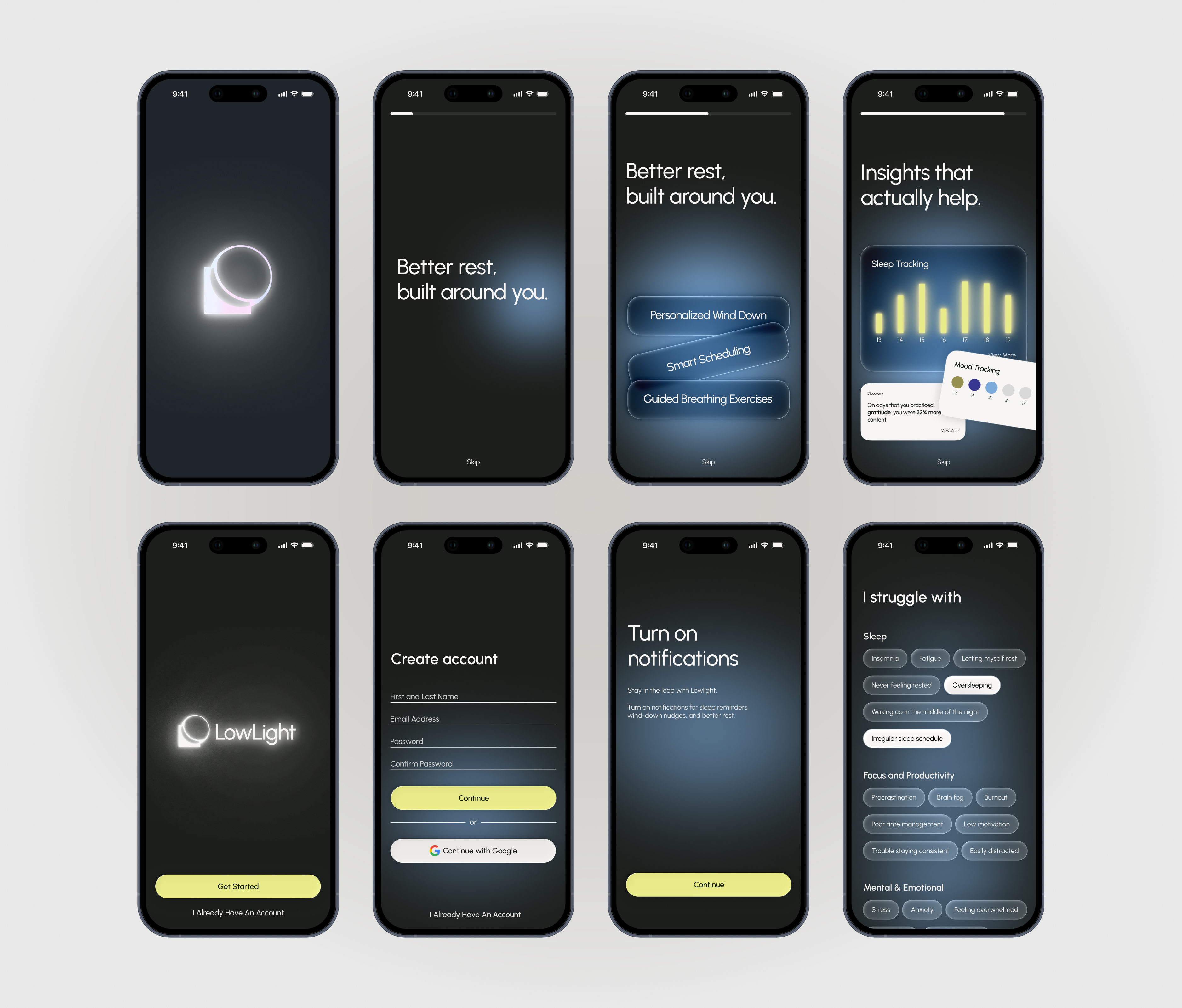
Onboarding establishes the app as a personalized space for winding down. Users share their preferences and goals so LowLight can better understand what helps them relax.
Lorem ipsum dolor sit amet consectetur. Facilisi mi placerat praesent vitae diam. Interdum lorem amet vel eu sit. Tellus nam scelerisque vitae lacus. Nibh aliquam amet faucibus senectus sed.
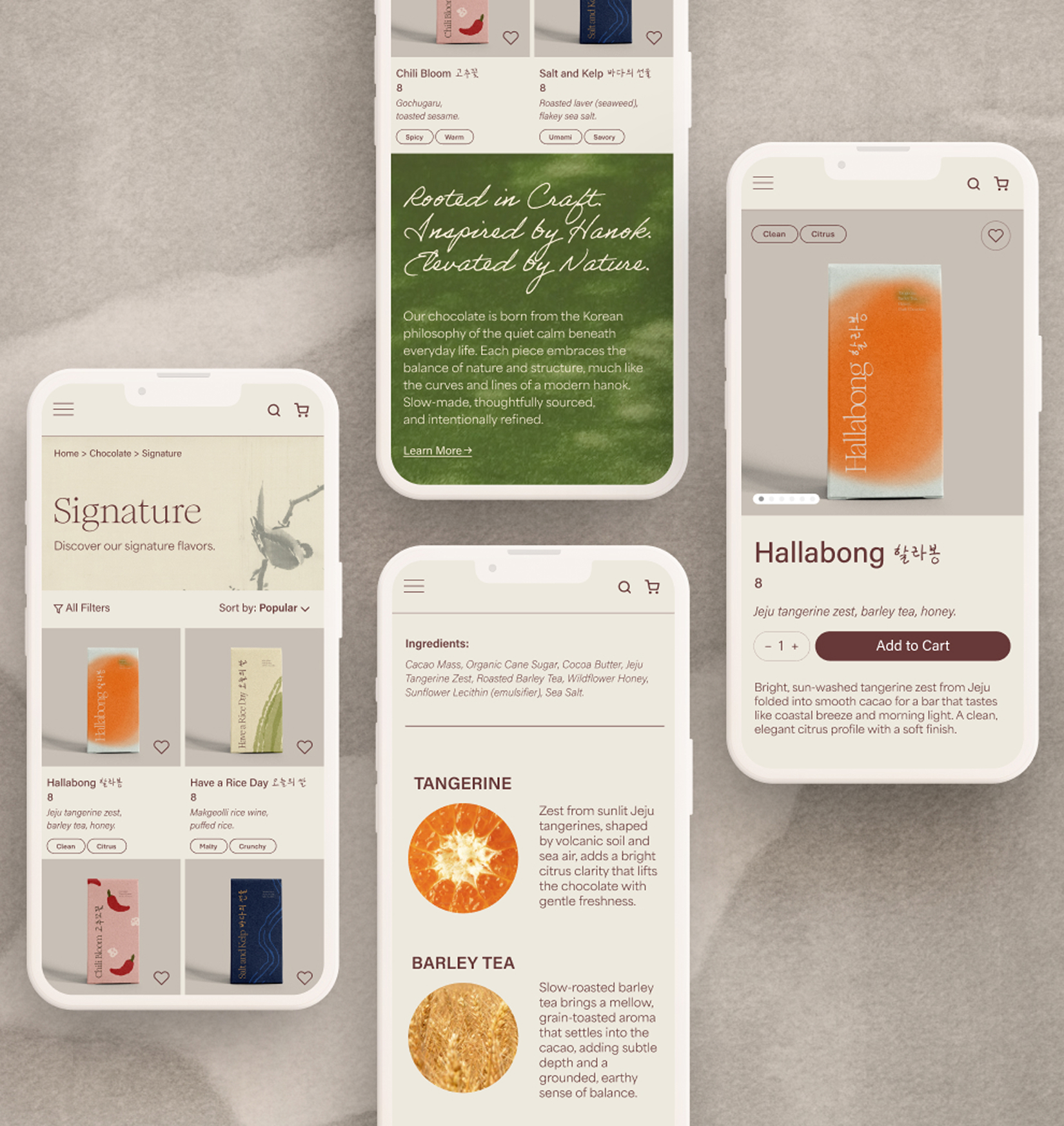
E-commerce branding for a conceptual luxury chocolate brand.
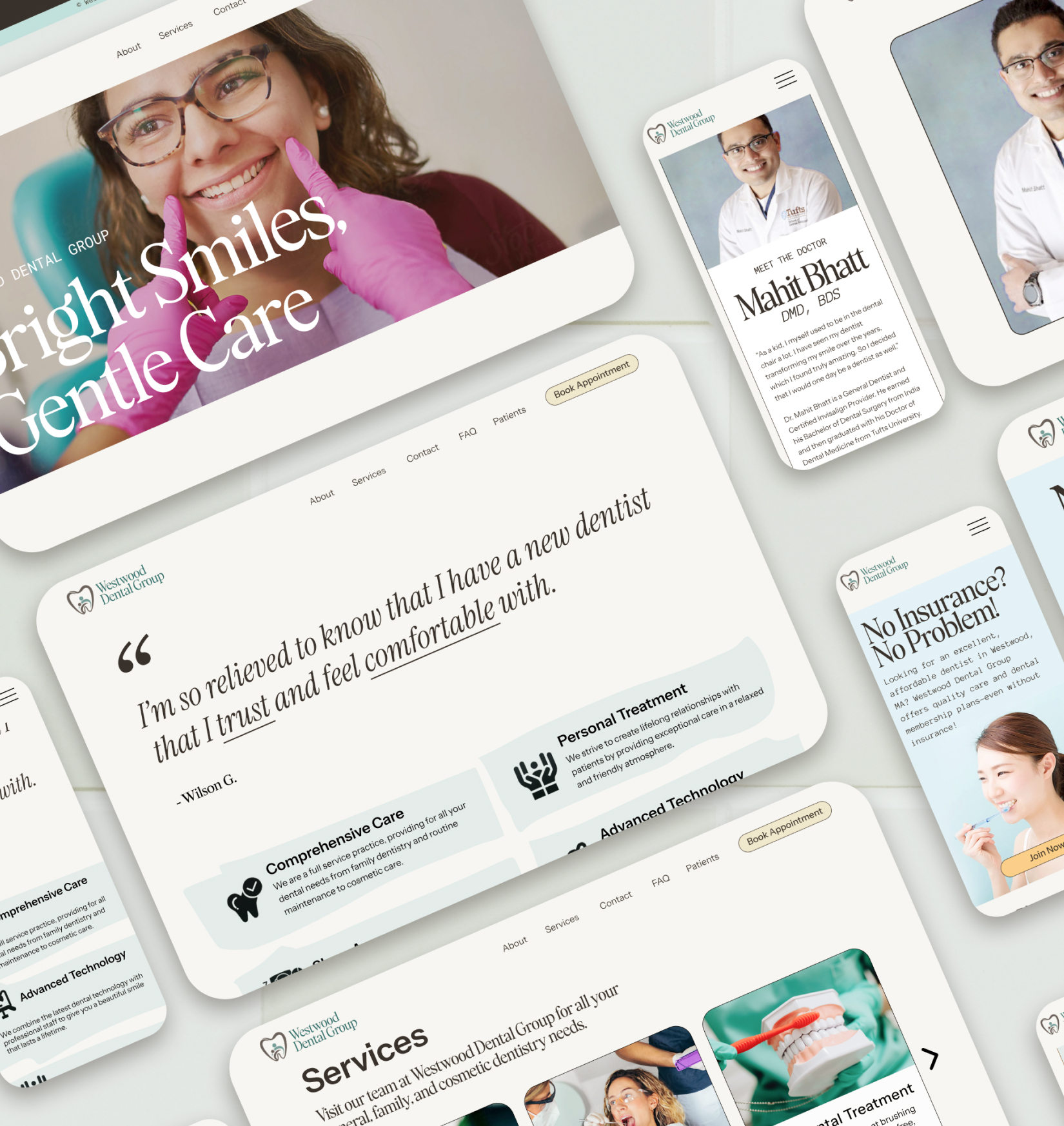
A warmer, more welcoming redesign for a dental practice website.