A quiet luxury chocolate brand inspired by Korean tea culture and slow living.
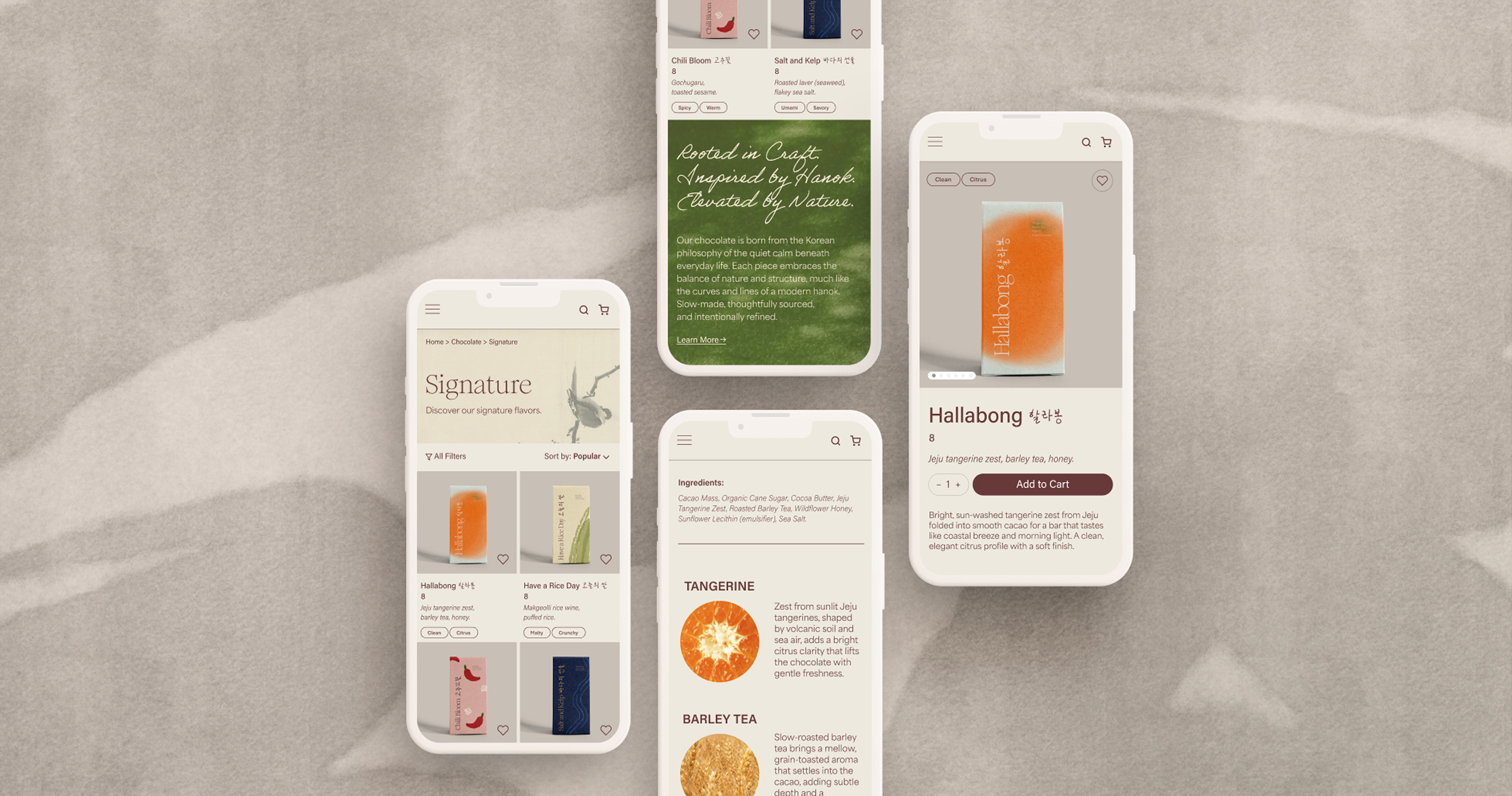
Namu, meaning “tree” in Korean, is a modern chocolate brand inspired by Korean flavors, tea culture, and the quiet beauty of nature. Rooted in the principles of slow living, Namu brings together nature and quiet luxury in a contemporary chocolate experience. The experience is designed to feel like stepping into a Korean tea house—quiet, warm, and poetic.
UI/UX, Branding
Figma, Illustrator, Photoshop
September — October 2025
Quiet, Refined, Natural
E-commerce Website, Brand Identity, Logo
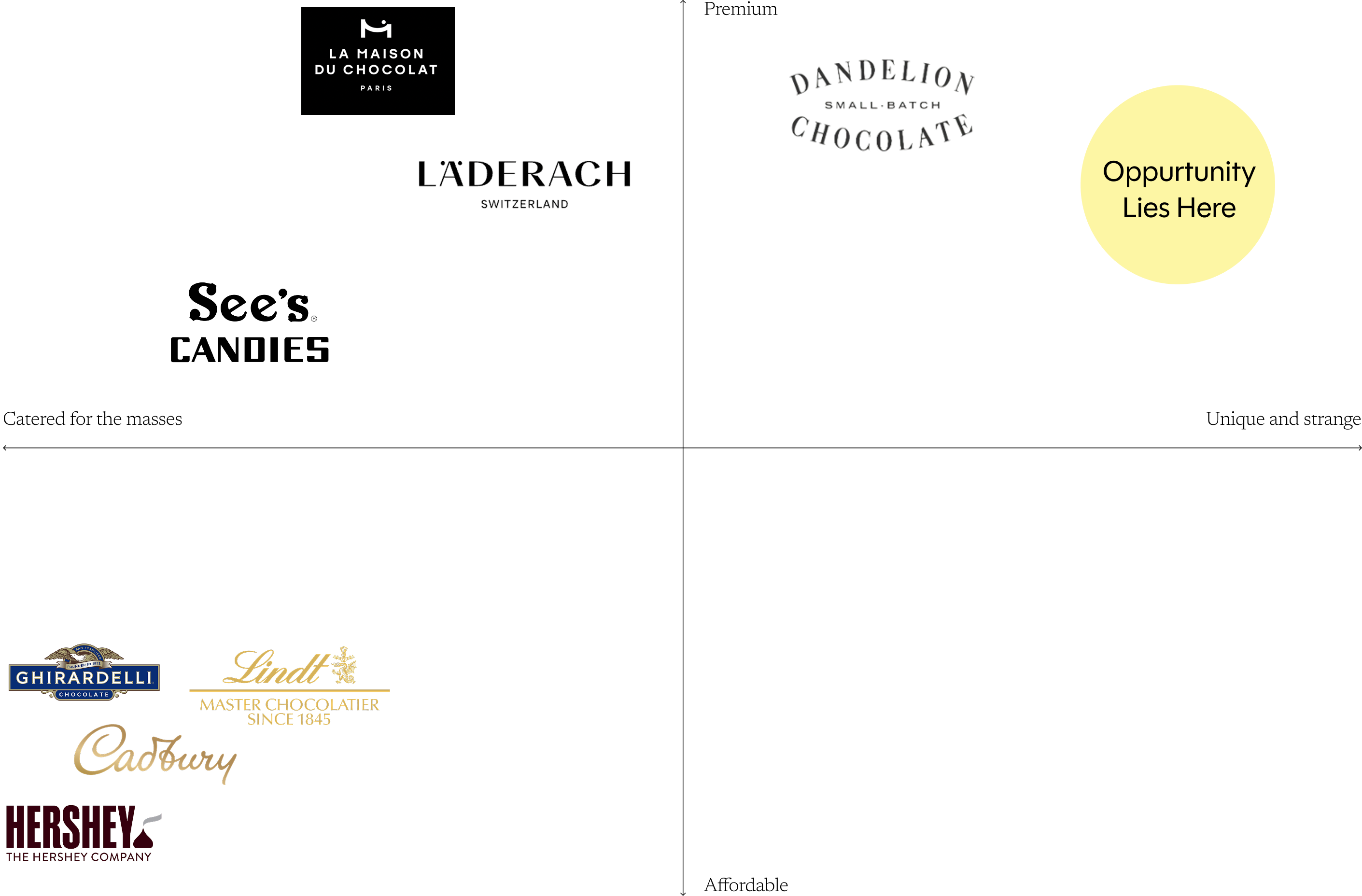
The matrix revealed an opportunity between luxury and experimentation. While luxury chocolate brands tend to favor familiar flavors and refined presentation, brands with more unconventional flavors often lean away from the traditional luxury space.
Namu brings these two qualities together, pairing unexpected Korean-inspired flavors with a refined, contemporary identity.

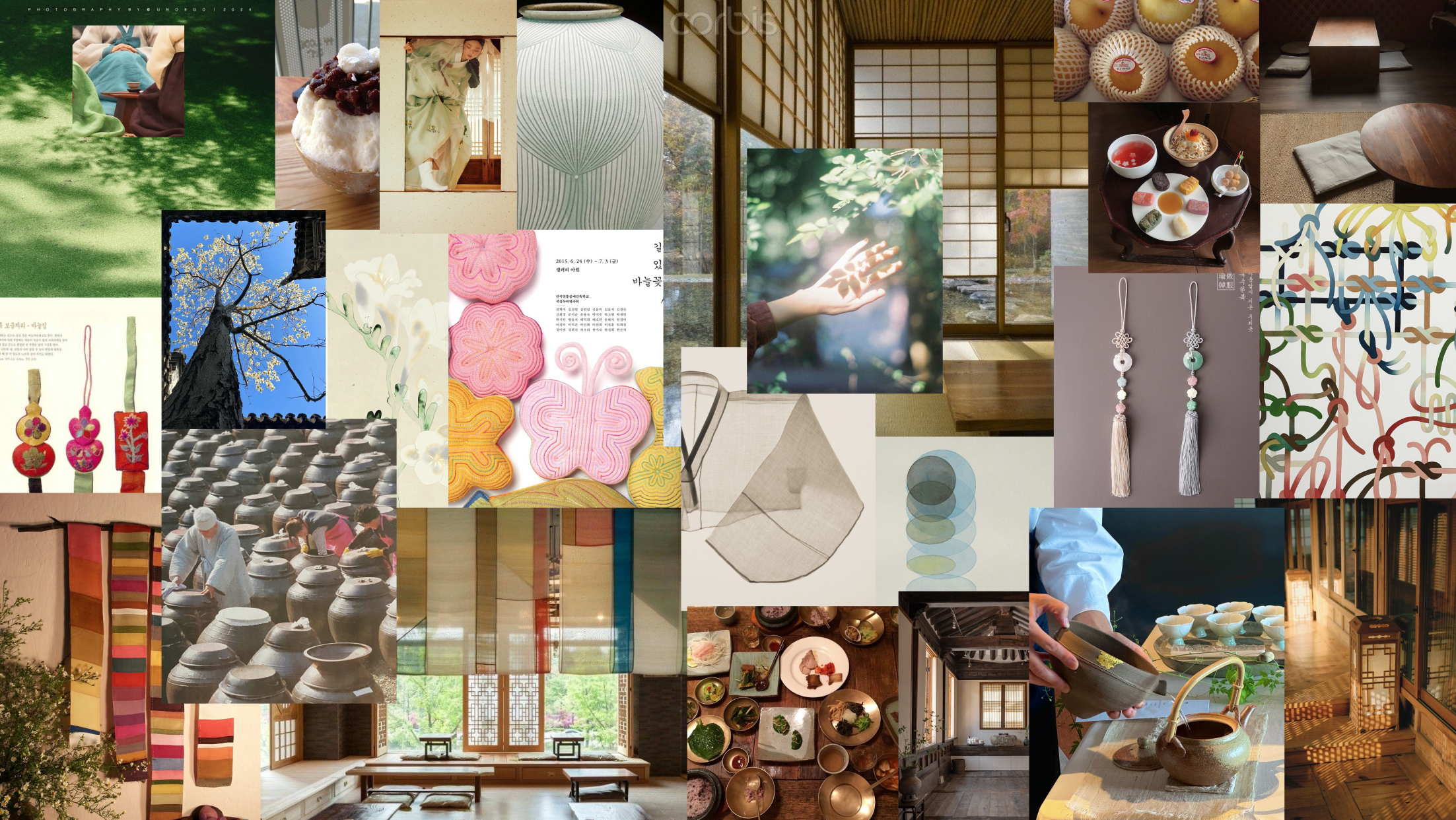
Taking inspiration from modern hanok and creating an environment of being surrounded by calm nature.
Minimalist look with natural textures and warm light.
Luxurious and beautiful in a traditional Korean way.
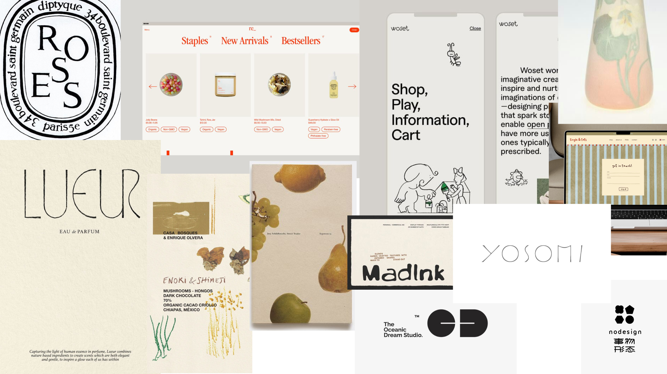
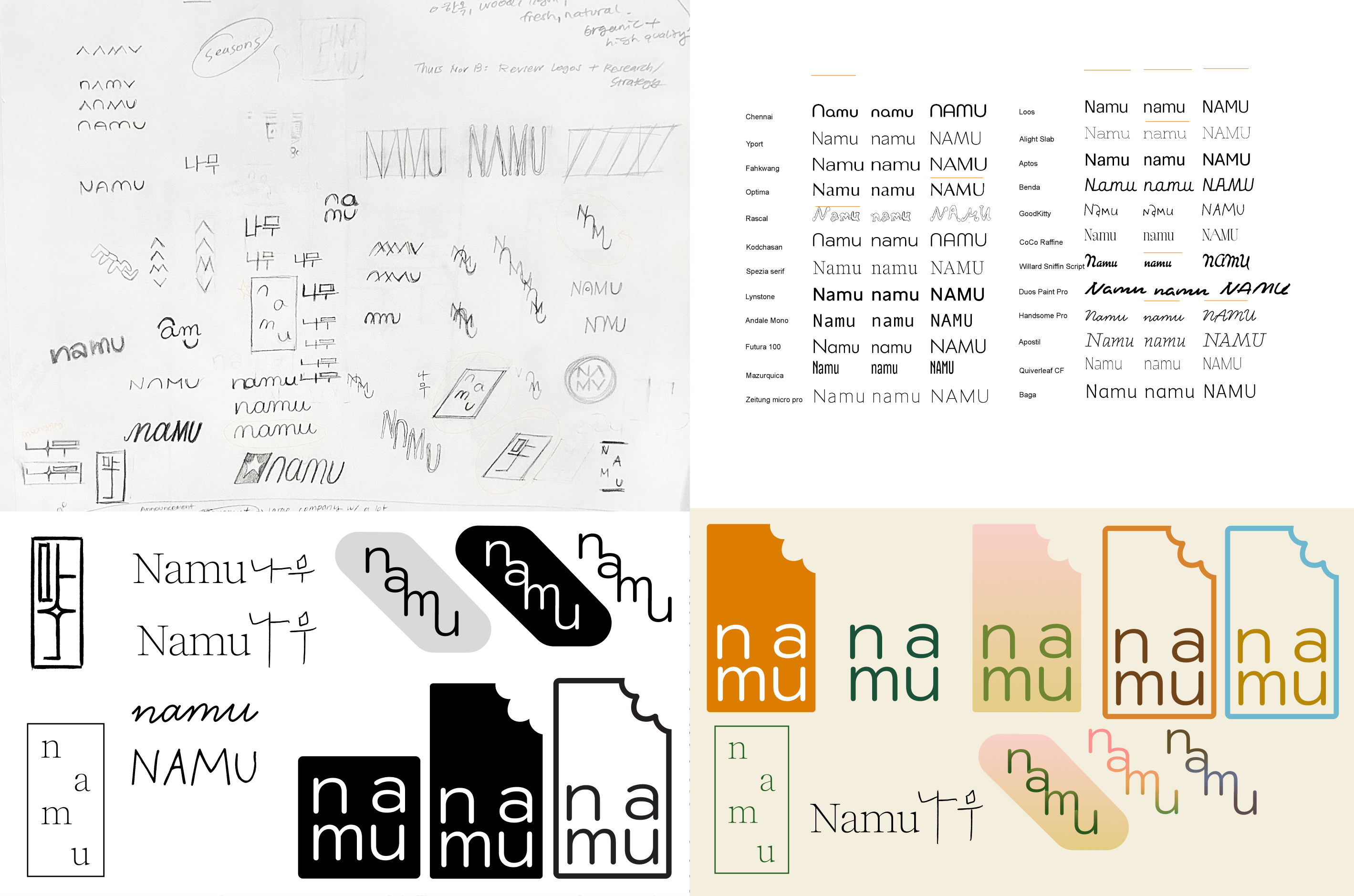
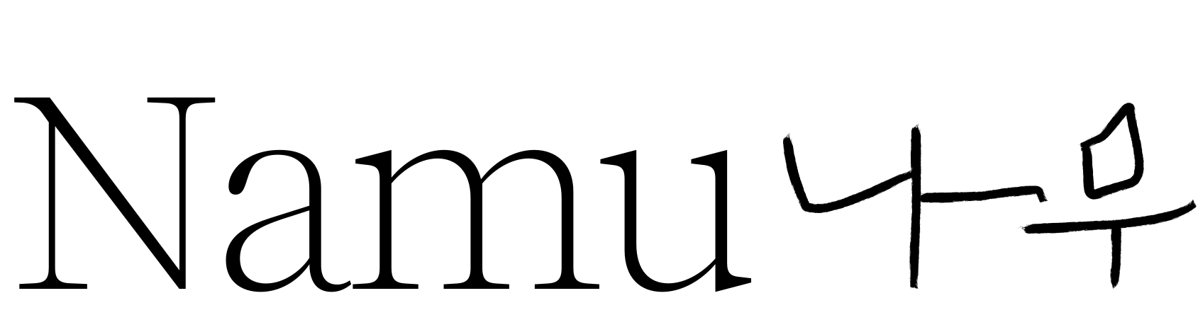
I explored different concepts and typographic directions in both English and Hangeul before refining the final logo. I wanted the wordmark to feel calm, classic, and grounded, with a simplicity that reflects Namu’s personality.
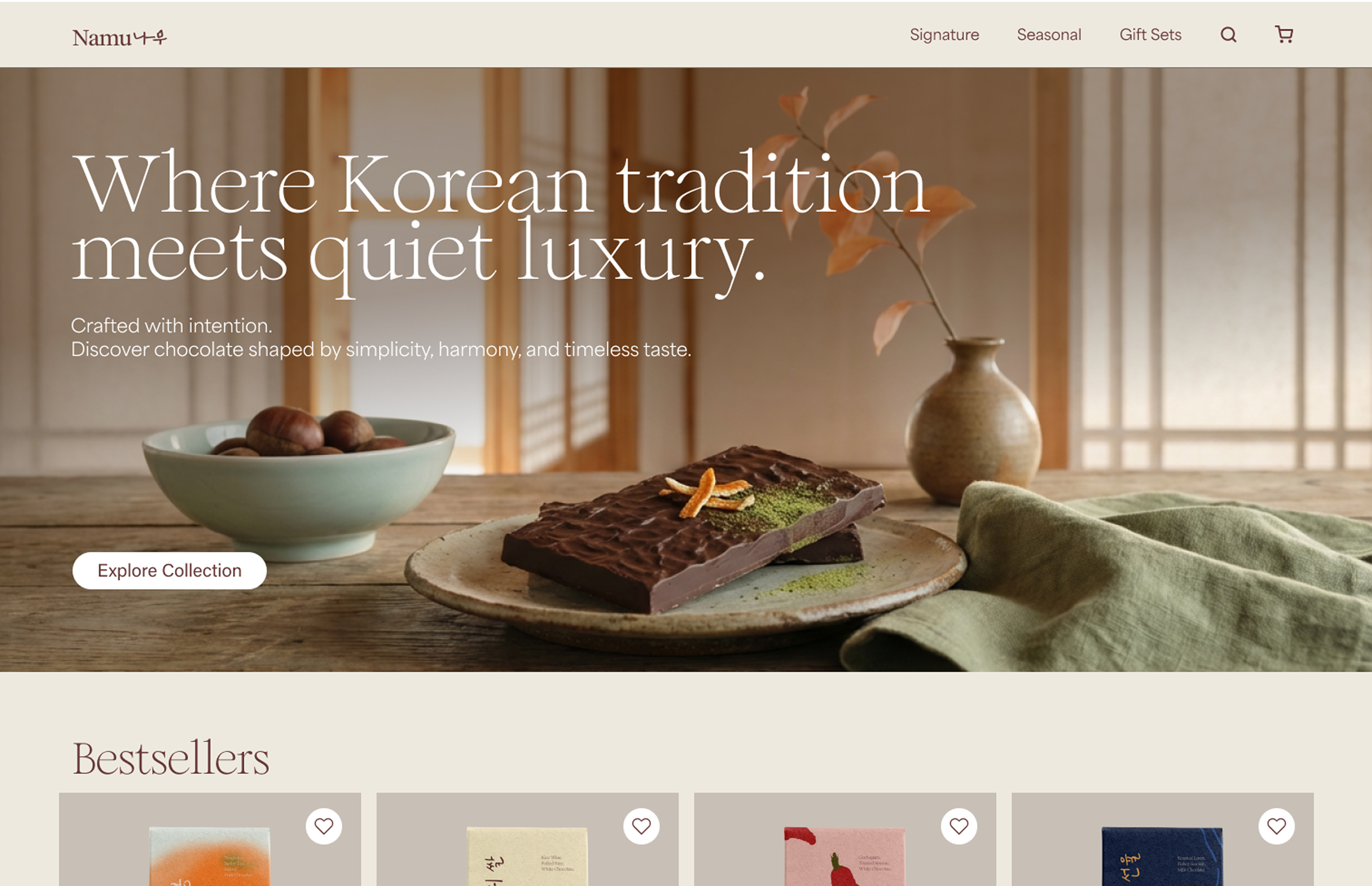
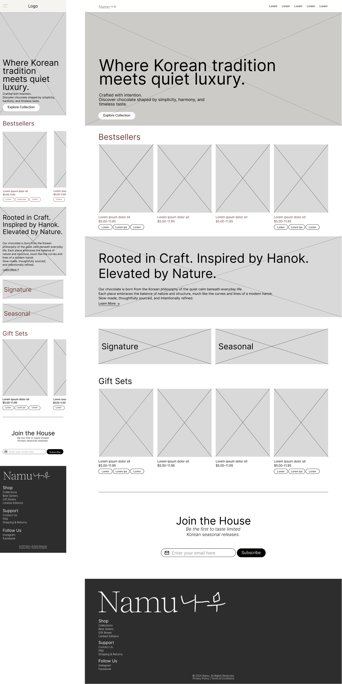
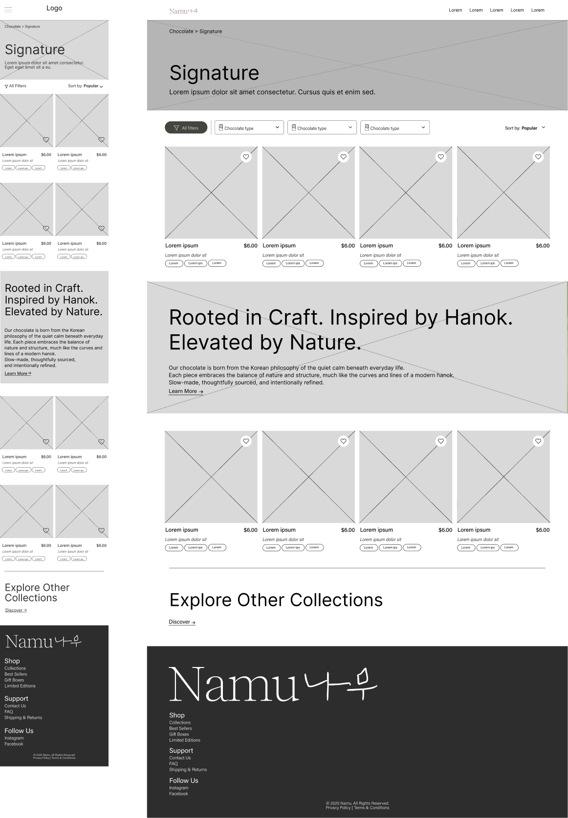
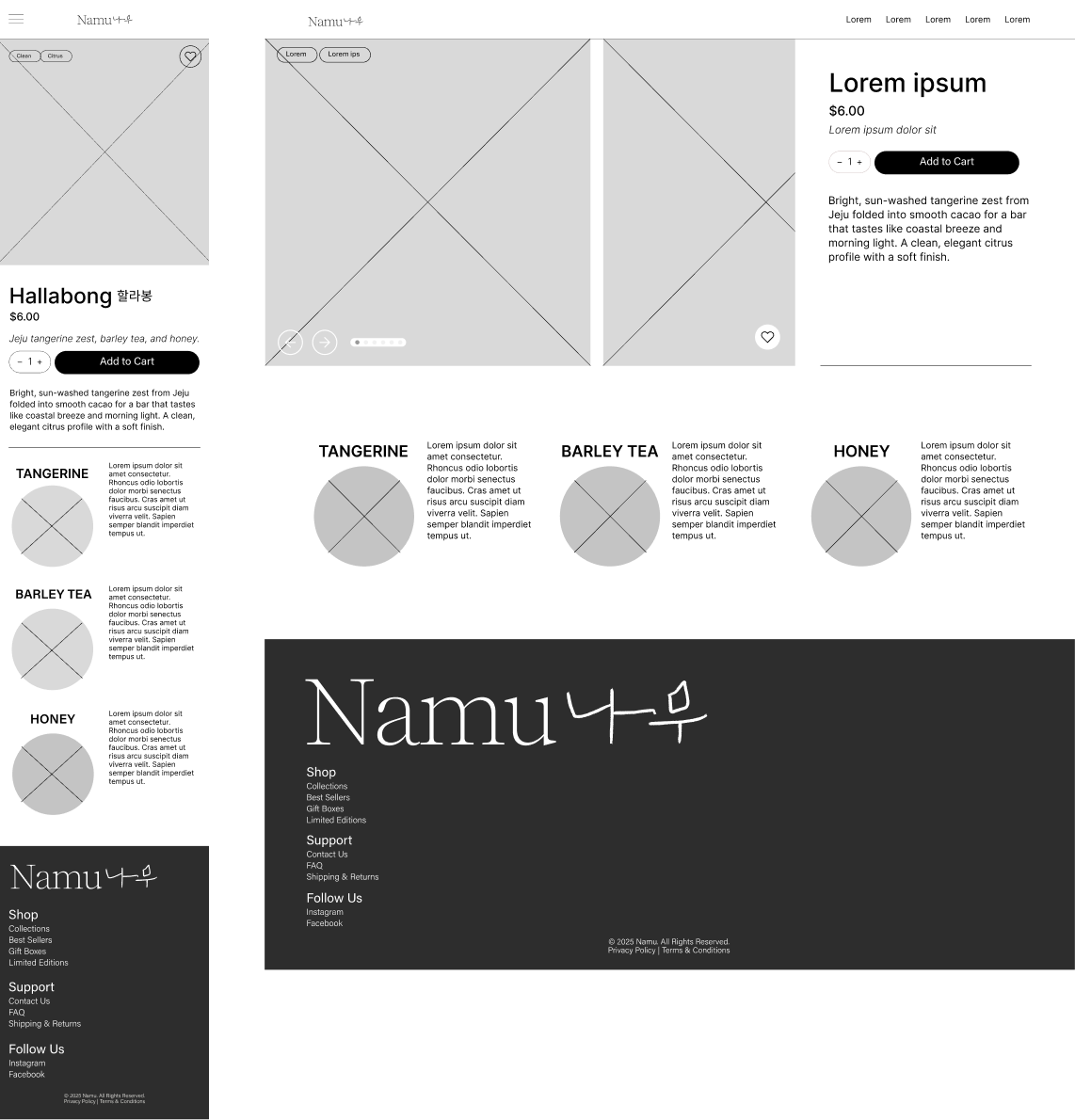
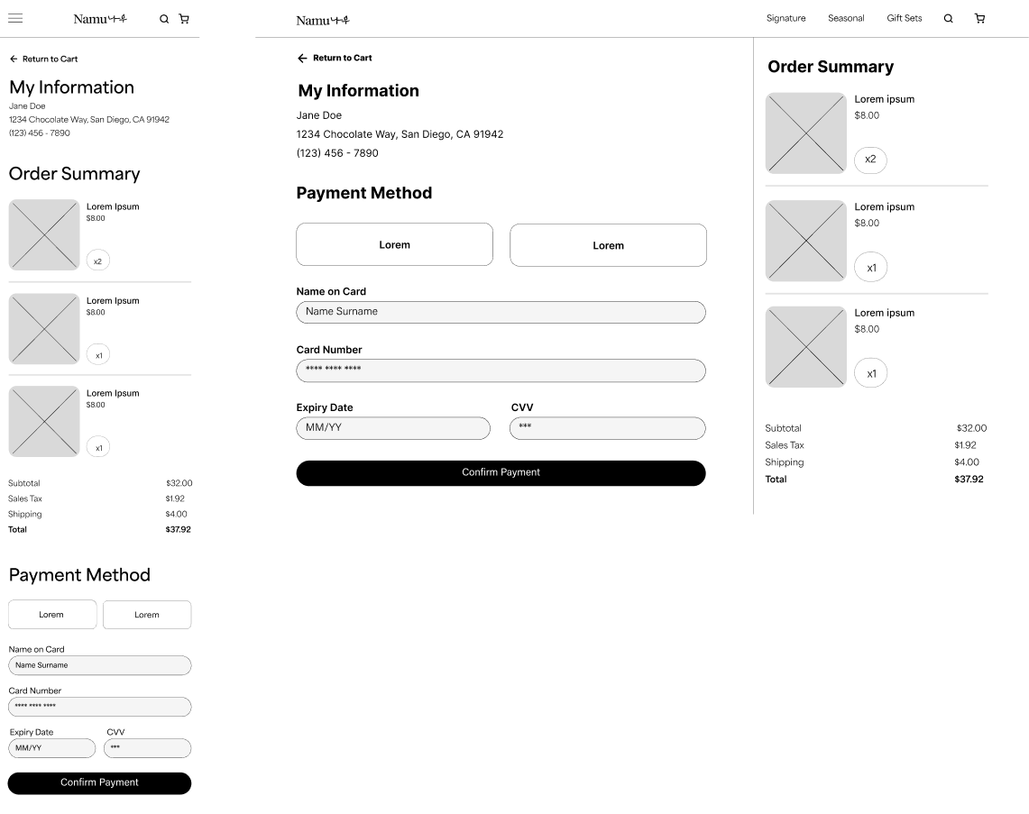
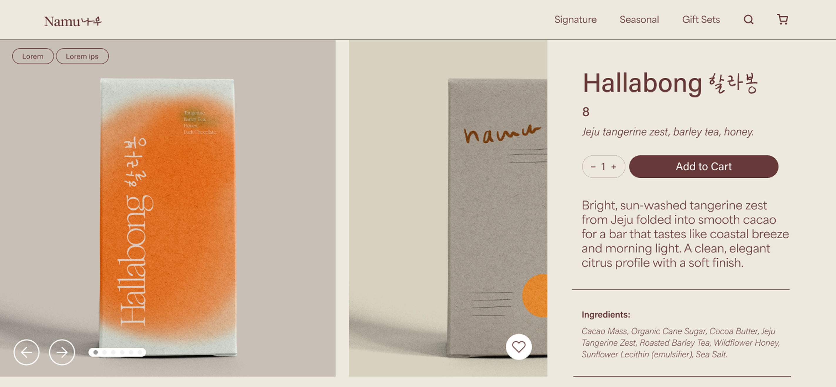
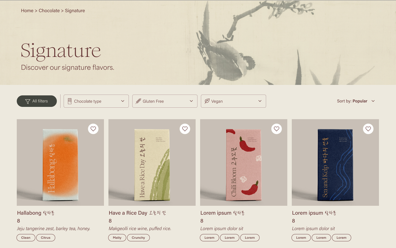
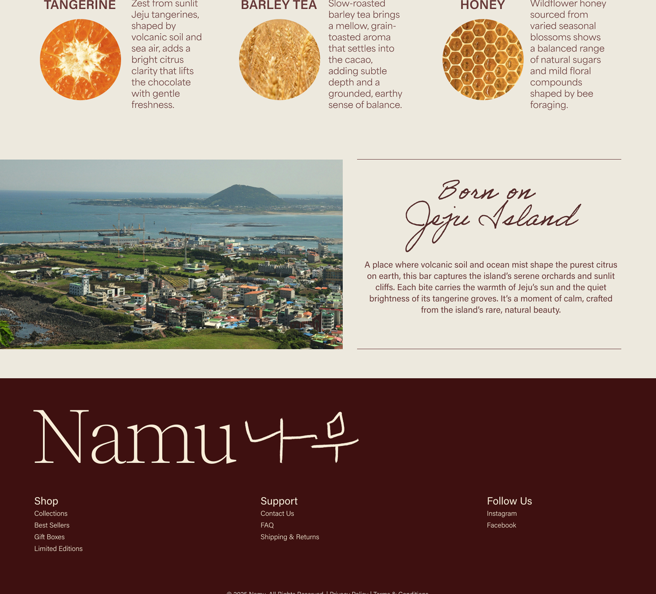
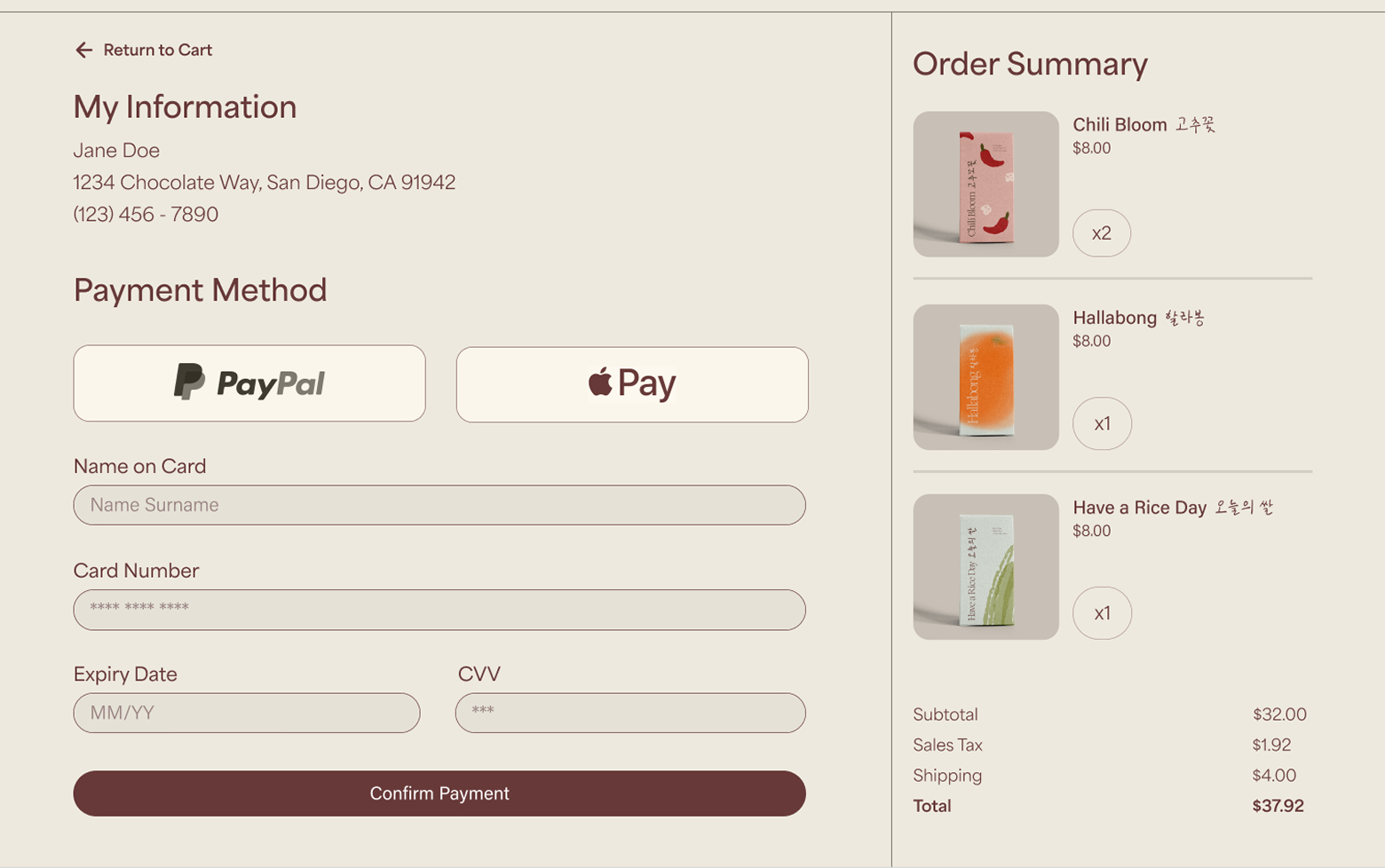
The website was designed to extend Namu’s quiet, refined identity into a digital experience. I focused on creating a sense of calm while keeping the shopping experience intuitive and easy to navigate.

#EDE9DE

#673938

claude type
robert slimbach

A warmer, more welcoming redesign for a dental practice website.

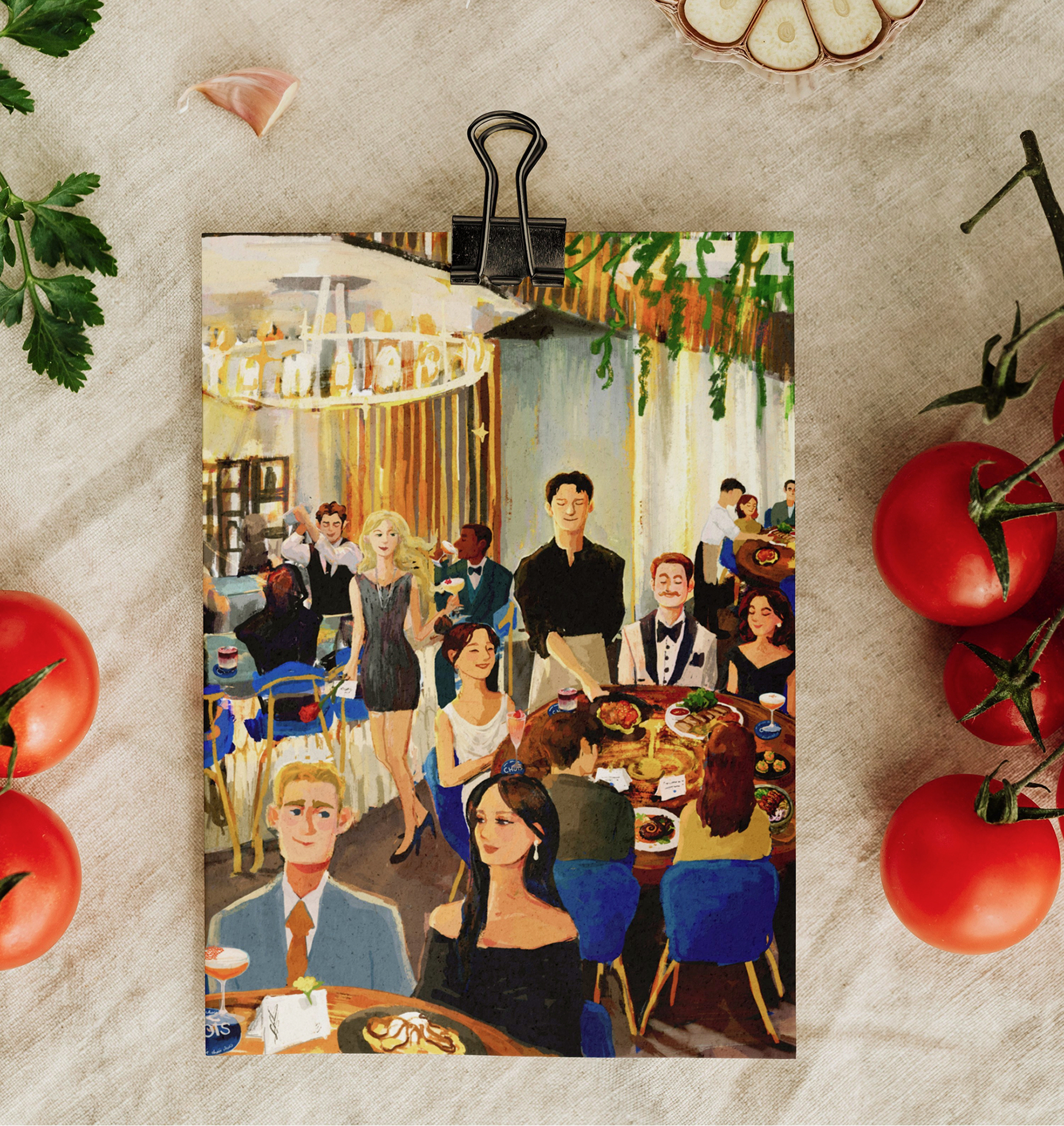
Custom illustrations and refreshed web design for an Asian fusion restaurant.